Qlik™ Introduces a New Era of Visualizations
A picture is worth a thousand words, but a visualization can tell a million stories.
Our ability to tell stories is an art form as old as language itself. From ancient cave paintings to oral traditions passed through generations, the essence of stories has evolved alongside our communication methods. It began with visual tales etched on cave walls, transitioned into spoken narratives, and eventually found its way into written, printed, and typed forms.
Ultimately, modern analytics and visualizations serve the same purpose as sharing and retelling stories: guiding business users to make important and informed decisions. These decisions, however, are not made alone, and require stories to persuade and engage others, often in boardrooms or video calls. But the goal of the story remains unchanged: to inspire action, instill confidence, and ensure safety.
So, what happens in the next chapter?
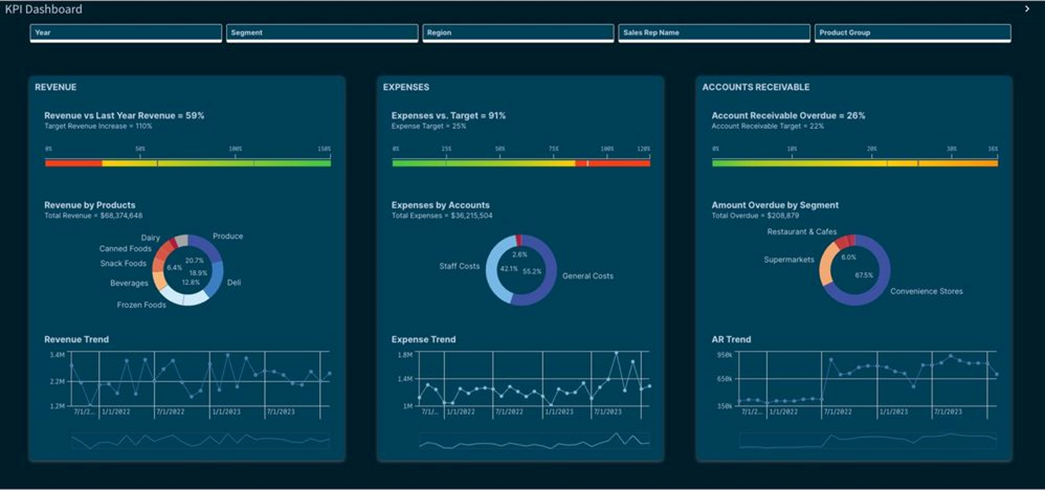
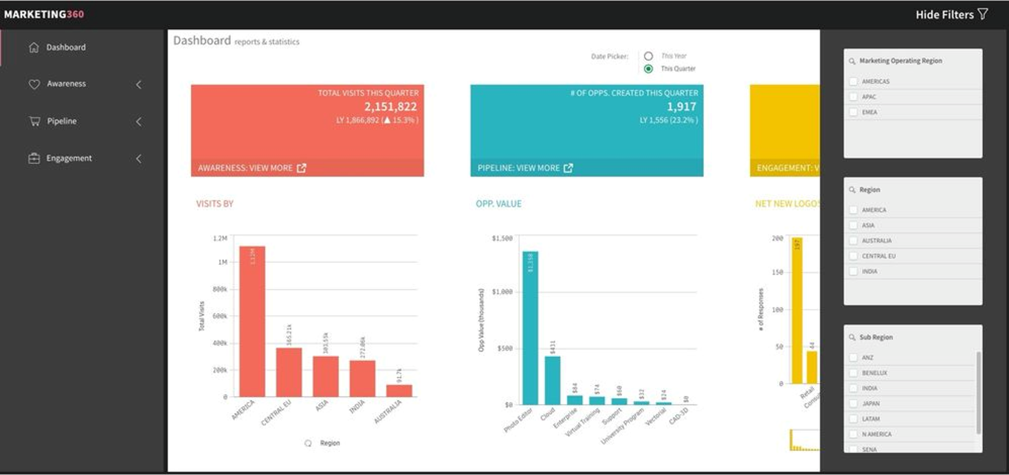
Today, Qlik™ has the pleasure to announce a new era in data visualization and dashboard design. With the latest advancements in Qlik™, you can bid farewell to the days of grappling with custom style sheets and juggling third-party add-ons. It’s time to explore your creativity and take control of your narrative like never before!
Chapters
1. The layout container adventure
Picture this: designing beautiful dashboards that are not only interactive but also fun and easy. Say hello to the Layout container, your new-found playground for creativity. Stack objects, craft custom and composite KPIs, and toggle individual object visibility with ease. With multi-selection, grouping, and a plethora of styling tools at your fingertips, designing experiences just got a whole lot faster and more intuitive. Need inspiration?
Watch the video below, created by Luis Felipe Tensini, Qlik™ Partner Ambassador, and prepare to be amazed by what you see!
2. Charting new narratives & filter pane styling
It’s not just about data; it’s about presentation. You now have the power to improve the way you tell your story. Control borders, shadows, fonts, and more to add depth and personality to your visualizations while maintaining your company’s branding. Explore data effortlessly with customizable filter panes. From grid mode to compact views, from checkboxes to radio buttons, tailor your data display for a truly immersive user experience.
3. Cyclic group dimensions delivered
Cyclic groups for Master Item Dimensions—another QlikView™ legendary feature delivered. Allowing users to dynamically cycle through dimensions in every chart, maximizing the potential to tell stories while conserving screen space. With this innovation, charts become versatile tools, accommodating multiple use cases effortlessly. Crafting compelling narratives is simplified: select the Cyclic option in the master items library, choose desired fields, and effortlessly switch between them in your chart.
4. A tale of dashboard themes…enhanced
Plot twist! We’ve introduced enhancements, including new straight tables, pivot tables, line objects, and rich text objects. Take command of your space with the ability to control the visibility of the main selection toolbar and sheet header, freeing up valuable real estate for content and custom navigation bars.
Cliff notes: Visualizations have undergone a remarkable makeover. You now have permission to evoke the freedom of creativity, captivate your audience, and transform data into insights like never before. The future with Qlik™ Cloud is bright!
From ancient cave tales to today’s dynamic dashboards, the evolution of storytelling parallels human communication methods. Innovation ushering in a future where every data point tells a tale waiting to be explored.
Your adventure into the world of Visualizations & Dashboards does not stop here… continue your journey and check out the ‘What’s New: Qlik Showcase App’ or these new and improved stylish apps below and see for yourself!
In the grand scheme of things, Qlik™’s evolution promises freedom, creativity, and limitless possibilities in data visualizations.
The only limit is your imagination.
Highlights:
- Filter pane styling: styling options for the filter pane.
- Chart Border and Shadow: More control for app developer. Use it to create depth effect, enhance or hide the border. Perfect for layout container. Overrides the theme setting.
- Layout Container: Freeform layout for grouping and stacking. New way to create content and design dashboards.
- Pivot Table: New pivot table and will replace native pivot in the future.
- Styling improvements: Grid, Funnel and Sankey chart is getting styling.
- Copy and paste style: Transfer styling settings from one chart to another.
- Cyclic master dimensions.
For information about Qlik™, click here: qlik.com.
For specific and specialized solutions from QQinfo, click here: QQsolutions.
In order to be in touch with the latest news in the field, unique solutions explained, but also with our personal perspectives regarding the world of management, data and analytics, click here: QQblog !

