What are the essential views you can use in Qlik™ ?
DASHBOARD PAGE
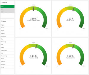
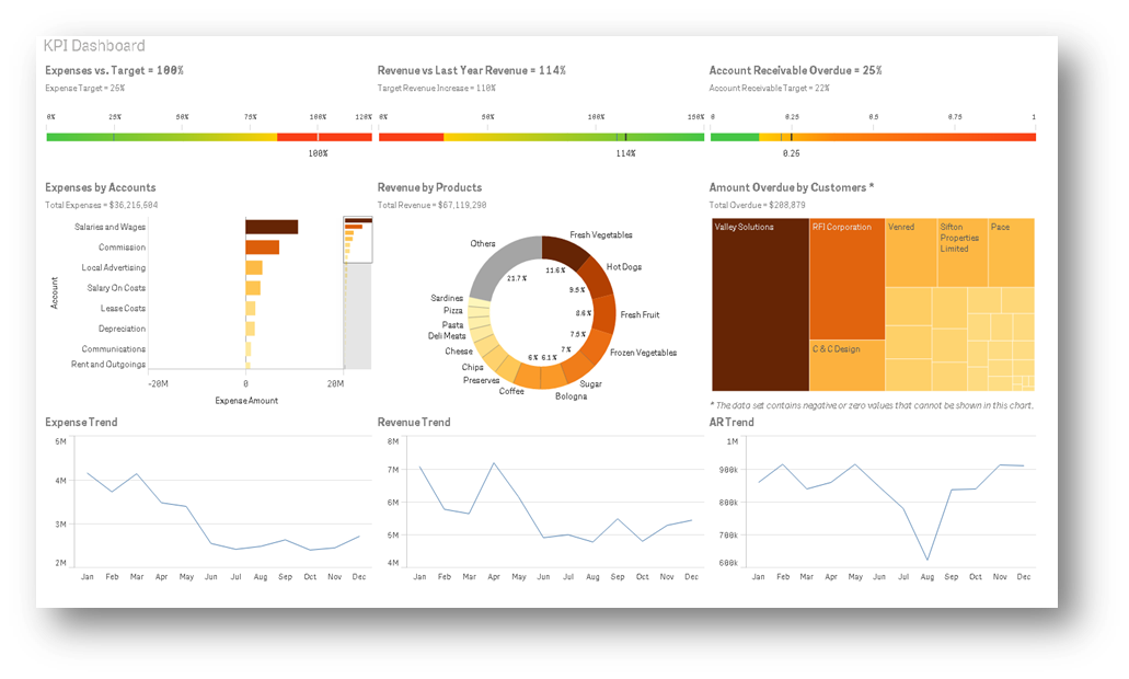
This is the pain page of the company / department, which allows the visualization of most important information. Most of the time it does NOT need a scroll to explain “how are we doing?”, the essential can be grasped at a glance.
The dashboards of Qlik™ can be compared, in terms of functionality, with the dashboard of an aircraft (both provide essential data for getting to your destination in optimal safety and efficiency).
The common dashboards usually focus on comparative percentage indicators between an indicator (measure) calculated for a recent period and a relevant reference (previous or targeted), but are often combined with absolute values, beyond percentages. In many cases, color codes are also used to highlight specific types of situations (generally red for negative impact and green for positive impact).
Below you will find possible visualizations options for a Dashboard:
Visualization elements from Dashboard pages
ADD-ONs DASHBOARD
TIMELINE ANALYTICS (IN TIME EVOLUTIONS)
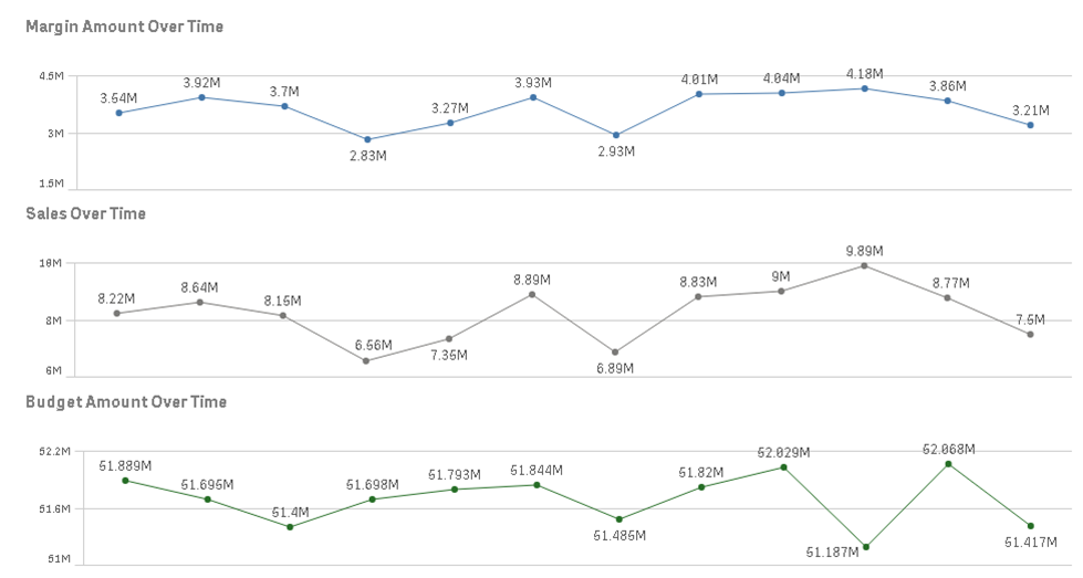
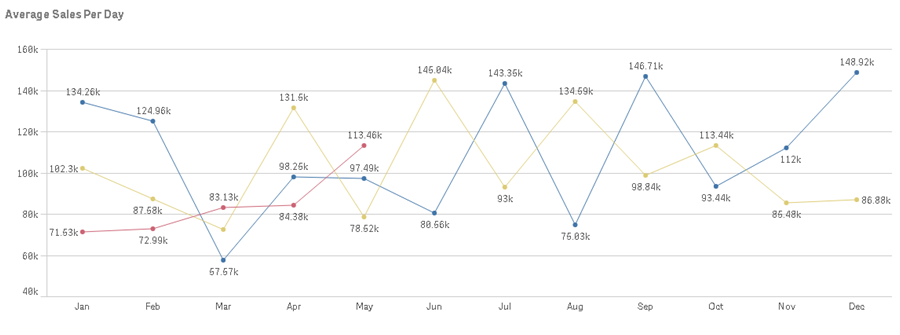
LINE GRAPH (TIMELINE) – is a graphical visualization of the variation of one or more parameters over time. Qlik™ allows several types of analyzes of these line charts, including comparative analyzes of developments.
It is also possible to offer in parallel evolutions of several indicators over time presented in adjacent objects, or to build more evaluated timeline mechanisms.
DEDICATED TIMELINE PAGES
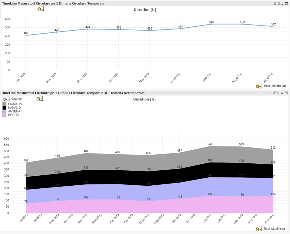
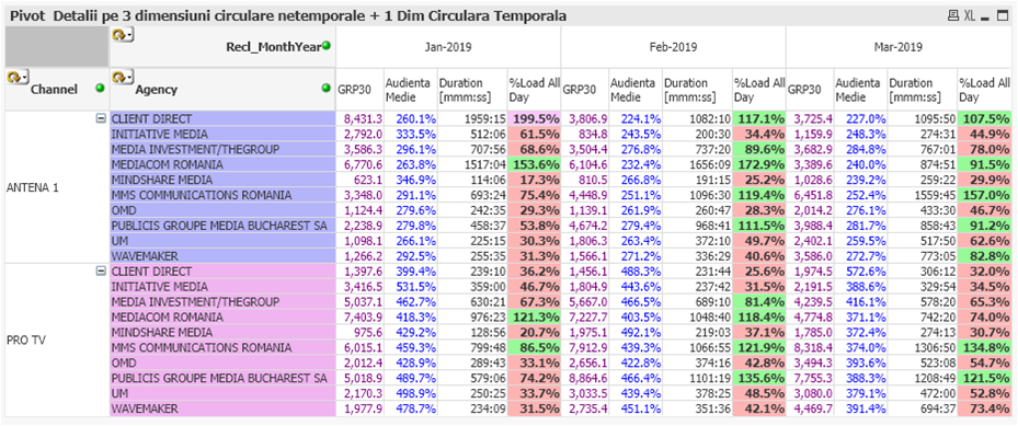
Timeline analytics in dedicated pages allow you to visualize multiple time perspectives. Line Chart and sometimes Bar Chart or even Waterfall are usually used. The common perspectives include at least 3 graphs and 2 pivot type tabular presentations.
The classic Timeline chart allows the identification of the variation of a numerical indicator (measure) according to a specific time dimension, which continuously covers a time horizon.
Starting from the first graph presented, we usually derive a graph that highlights the evolution of the distribution over time of an indicator, with the breakdown by an important non-temporal dimension.
We recommend avoiding non-temporal dimensions with too many entities, in order to be able to highlight this information in an intelligible way.
DEDICATED TOPs PAGES
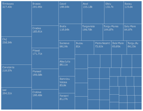
The visualization of some tops (usually descending) allows you to identify the ranking and relative performance of each entity in the dimensional column (City) in relation to a particular measure (Sales Value, in RON).
When there are too many entities to be included in the top objects, there is the option to maximize the object to full screen. You can also use the scroll option inside the visualization object. In Qlik Sense™ there is also the thumbnail scroll option, highlighted above in the right side.
DYNAMIC PAGES AND OBJECTS
Dynamic objects allow a larger number of analyzes to be encapsulated in a single object. With this approach, a single object can contain, simultaneously, tens, or hundreds, or even thousands of visualization variants for which the development time and cost in the interface could become huge.
For instance, even for a very simple Bar Chart object with Descending Tops, if it is defined to offer, at the user’s choice, directly in the interface, at the time of consuming the analysis.
Putting these variants together, even in minimal variants, we obtain in a single object a set of options of 5 measures x 2 coins x 5 dimensions = 50 different variants of analysis (and this without considering any filtering option on a subset of data in the report generation).
OTHER IMPORTANT VISUALIZATIONS
COMBINING TABLES WITH GRAPHICS: MINI-GRAPHICS
All studies of the use of managerial analysis interfaces have shown that graphical visualization is more efficient than tabular representation in highlighting the essential factors of a business.
The explanation: The human mind contains a much more advanced image processor than its digital processor, which is applied in a more abstract plan.
For situations where the graphic objects cannot contain enough details, we recommend the use of mixed objects, in which the tables integrate graphic content into the table cells. Graphics, including MiniCharts and Trellis provide information at a digestible level still visually, not just numerically.
SCATTER CLOUD CHART
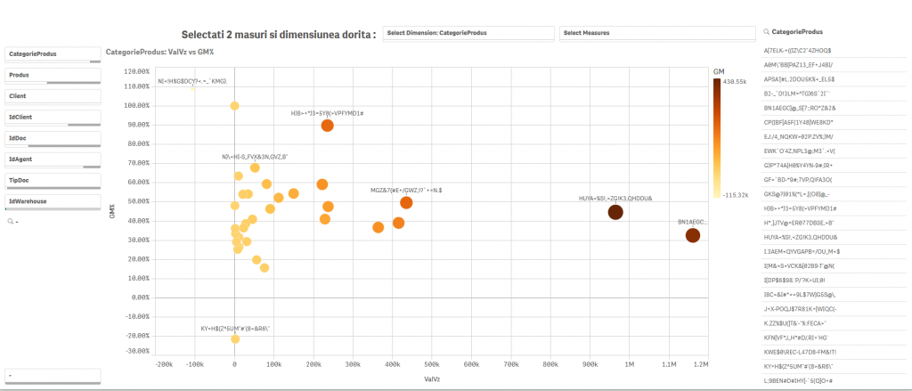
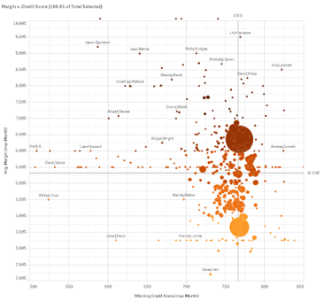
SCATTER CLOUD ANALYSIS is used to visualize the simultaneous spread of a set of 2-3-4 measures in the population of analyzed entities (1 dimension of analysis).
Such an analysis may highlight:
- similar phenomena by grouping (clustering) the points,
or
- the belonging of the points to certain curves that may suggest possible correlations between the analyzed measures,
or
- the lack of population of certain areas of analysis may suggest phenomenological limitations.
One of the most valuable economic representation of scattering is the one in which the value sale is represented on the horizontal axis, and the percentage margin on the vertical one (at the top, in the right side there are goden hens !).
In the example above, you can dynamically choose, directly in the interface, for the horizontal, vertical, and perpendicular axes (disk size) from several represented measures. Staining can be associated with a 4th measure.
WATERFALL CHART
More details about waterfall visualization and factor analysis (also called cause-effect analysis) can be found here.
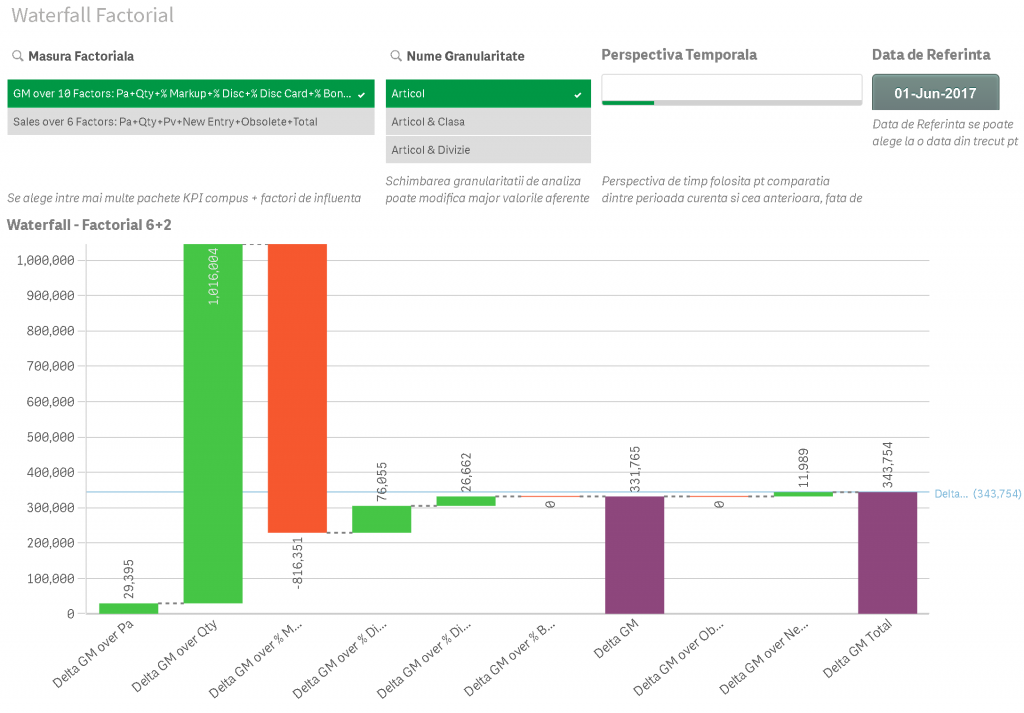
It is a graphical representation that helps you visually understand the cumulative effects of sets of positive and negative values, which change the results of important indicators.
In the next image you can visualize a combined presentation of the logic of factor analysis with the presentation of Waterfall, which highlights the way of how each factor brings:
- a plus (green)
- or a minus (red),
to the final result, the one to the right of the graph.
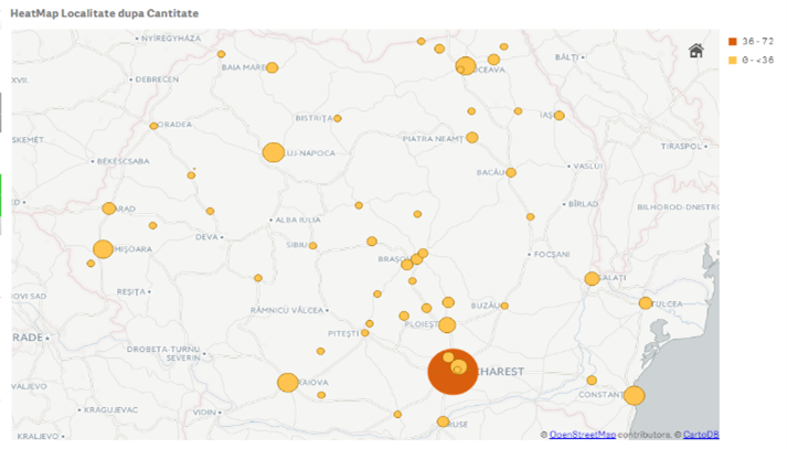
GEOSPATIAL ANALYTICS
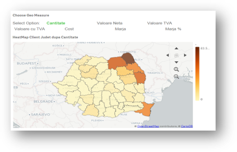
This kind of analysis can also be used as a GeoMarketing tool, which allows the identification of areas that are insufficiently exploited commercially or with operational problems. In the example below, you can choose from several measures represented: Sales, Sales per thousand inhabitants, Number of customers or Number of transactions or deliveries.
Zonal analyzes can be performed at any level for which there are data to substantiate the visualization.
Geo-spatial analyzes can also aim, going beyond the marketing sphere, moving towards operational analysis, visualizing the stocks available in each targeted area, possibly correlated with the sales volume in the same area, or even analyzing, per product, in areas where it was sold or in areas where it remained in stock.
Qlik™ geospatial analyzes also allow the overlapping of the above representations, or the addition of visual route information and/ or other quantitative or qualitative information valid for geographic point pairings.
Remarks:
For most of the above objects there are also complex variants, in which the user can choose, on the spot, between several measures and several dimensions.
This material aims to understand the basic concepts in the views offered by a BI solution, efficiency, time saving and accelerated analysis speed being immediate benefits.
For specific and specialized solutions from QQinfo, please visit the page: QQsolutions.
In order to be in touch with the latest news in the field, unique solutions explained, but also with our personal perspectives regarding the world of management, data and analytics, we recommend the QQblog !
For details about Qlik™, please visit the following page: qlik.com
