Page Content
Dashboard- DEMO
Qlik™ now offers style dashboards faster!
For a brief demonstration, click here: https://www.youtube.com/shorts/N5Ka5YXoOaY.
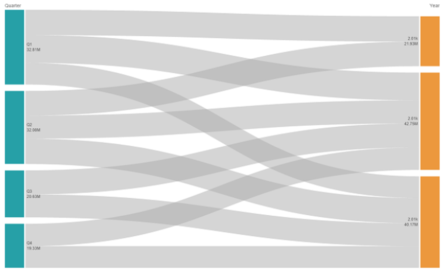
Where are my ”Discounts” going?
Bar charts don’t show FLOW…
Information is difficult to decipher…
Use a Sankey chart to easily show flow. Information flows from source to target. Source is on left, target on right. Links show “Discount” amount applied to target.
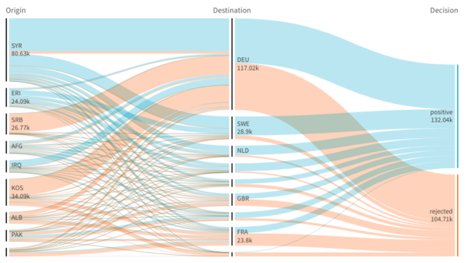
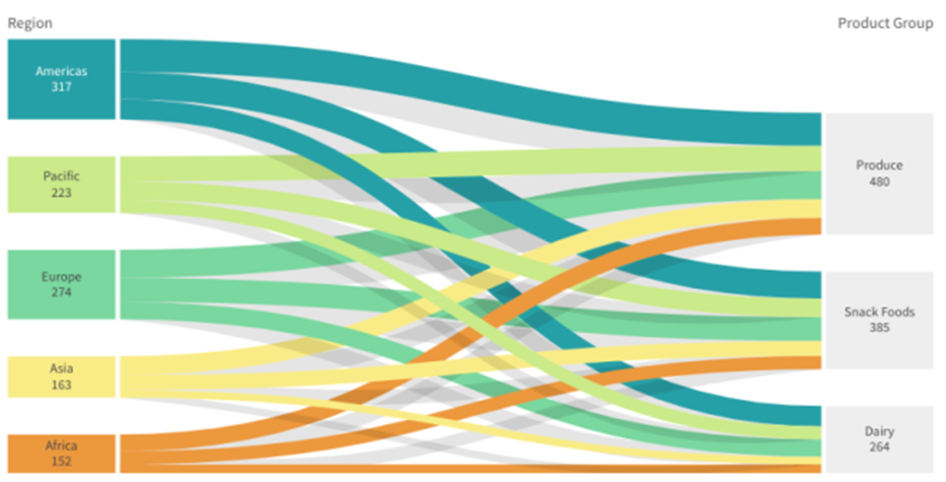
Sankey Chart
The Sankey chart lets you add a specific type of flow chart to the sheet you are editing. The chart visually emphasizes major transfers or flows within defined system boundaries. The width of the chart arrows is shown proportionally to the flow quantity. The Sankey chart is included in the Visualization bundle.
- A minimum of two dimensions and one measure is required. You can use up to five dimensions, but only one measure.
- The dimensions do not need to be of equal size on each side of the diagram.
- You can use the dimension values to set the color of the flows in the chart.
Link colors can be based on source or target anchor.
Sankey Chart - DEMO
For a brief demonstration about how to use Sankey chart, click here: https://www.youtube.com/shorts/hUGtmuEKqGo.
For a brief presentation of Sankey chart, click here: https://help.qlik.com/en-US/sense/November2023/Subsystems/Hub/Content/Sense_Hub/Visualizations/VisualizationBundle/sankey-chart.htm.
When to use it
The Sankey chart is useful when you want to locate the most significant contributions to an overall flow. The chart is also helpful when you want to show specific quantities maintained within set system boundaries.
Creating a Sankey chart diagram
You can create a Sankey chart on the sheet you are editing.
Do the following:
- In the assets panel, open Custom objects > Visualization bundle and drag a Sankey chart object to the sheet.
- Click the top Add dimension button and select the source dimension for the flow of the chart (appears to the left).
- Click the second Add dimension button to select the target dimension for the flow of the chart (appears to the right).
- Click the Add measure button to select the measure of the chart.
Once dimensions and measure have been selected the Sankey chart diagram displays automatically (in color) in the chart field.
Adding additional dimensions
You can add up to five dimensions to your chart in property panel under Data > Dimensions. The chart updates to reflect the added dimensions. The dimensions are displayed from left to right, with the first entered dimension always being the source dimension. The target dimension is always displayed to the to the right. When you add more dimensions, they are added to the right in the order they are entered.
Sorting
Sankey chart elements are automatically sorted from largest to smallest flow. You can change the sort order in the property pane.
Do the following:
- Click Sorting under Appearance in the property panel.
- Toggle Sorting from Auto to Custom.
- You can toggle Sort numerically:
- Toggle on: Sort numerically by Ascending or Descending.
Toggle off: Drag your dimensions and measurements into the desired order.
Changing the appearance of the chart
Link colors
The colors of chart links are based on either the source or target anchors. To apply the source or target anchor color to chart links either use the string =’SOURCE’ or =’TARGET’. You can also select a separate color by entering a color code string. The color should be a valid CSS color.
Do the following:
- Click Presentation under Appearance in the property panel.
- Enter the applicable string under Link color.
- Press Enter and the chart updates.
You can also change the link colors using an expression in the Expression editor (fx). It is also possible to color a link that has its intensity based on the Margin % of the dimension values it represents.
Example:
Enter the string =rgb(round(Avg ([Margin %])*255), 100, 100) where Margin % is a value between 0-1 and the link will display as red in the chart.
Link opacity
You can adjust link opacity by moving the slide button of the link opacity slider under Appearance > Link opacity in the property panel. Also, setting opacity to 1 (furthest right) allows the setting to drop a shadow, giving links a more individually distinct appearance.
Node colors
You can change the node colors of each dimension value. The color should be a valid CSScolor.
Do the following:
- Select applicable dimension under Data > Dimensions in the property panel.
- Enter the color code string under Node color and press Enter. The chart will update.
For example: To use the color Aqua (#00ffff) set the color code string to =’#00ffff’. You can also set the node colors using an expression in the Expression editor (fx).
Node padding and width
You can set both the vertical distance between nodes (“node padding”) and the horizontal width of chart nodes (“node width”).
Do the following:
- Click Presentation under Appearance in the property panel.
- Move applicable slide button of the Node padding and/or Node width sliders to adjust node settings.
Bar & Line charts - DEMO
For a brief demo about Bar & Line charts, click here: https://www.youtube.com/shorts/nPMHpXsYNog.
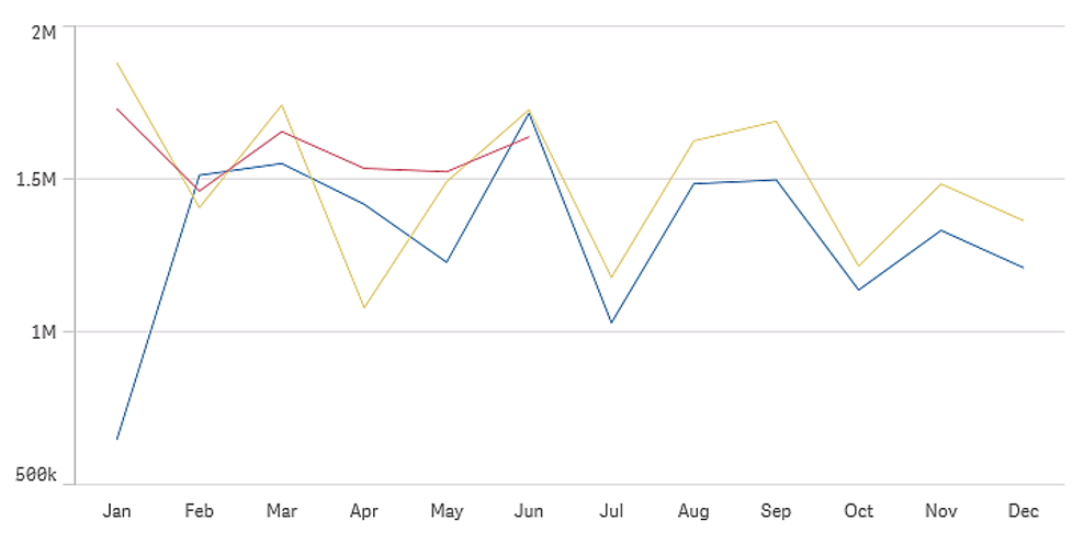
Line Chart
- Better represents time series data
- Shows changes over time
- Best used with date and time fields
The line chart is used to show trends over time. The dimension is always on the x-axis, and the measures are always on the y-axis.
Your data set must consist of at least two data points to draw a line. A data set with a single value is displayed as a point.
If you have a data set where data is missing for a certain month, you have the following options for showing the missing values:
- As gaps
- As connections
- As zeros
When a month is not present at all in the data source, it is also excluded from the presentation.
Line Chart - DEMO
For a brief presentation of Line chart, please check this link: https://help.qlik.com/en-US/sense/November2023/Subsystems/Hub/Content/Sense_Hub/Visualizations/LineChart/line-chart.htm.
When to use it
The line chart is primarily suitable when you want to visualize trends and movements over time, where the dimension values are evenly spaced, such as months, quarters, or fiscal years.
Advantages
The line chart is easy to understand and gives an instant perception of trends.
Disadvantages
Using more than a few lines in a line chart makes the line chart cluttered and hard to interpret. For this reason, avoid using more than two or three measures.
Creating a line chart
You can create a line chart on the sheet you are editing.
Do the following:
- From the Assets panel, drag an empty line chart to the sheet.
- Click Add dimension and select a dimension or a field.
- Click Add measure and select a measure or create a measure from a field.
In a line chart you need at least one dimension and one measure.
You can include up to two dimensions and one measure, or one dimension and up to 15 measures in a line chart.
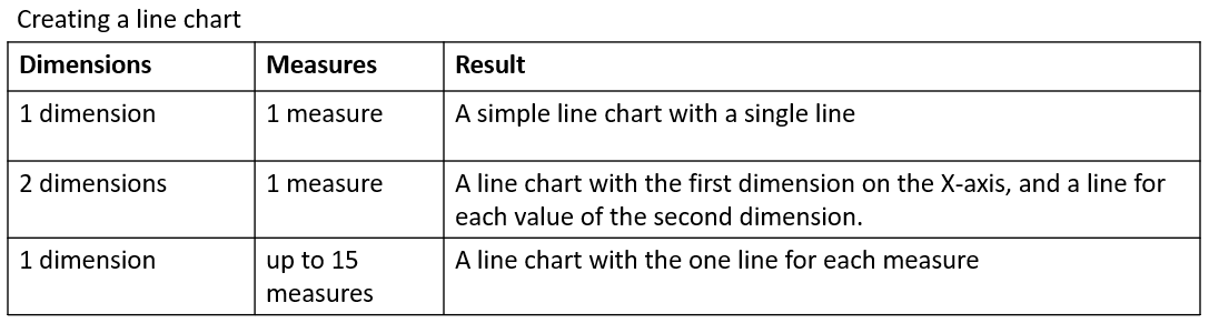
When you have created the line chart, you can adjust its appearance and other settings in the properties panel.
Styling the line chart
You have a number of styling options available in the properties panel. Click Styling under Appearance > Presentation to style the text, background, data point size, and lines at the chart level (for the entire chart). The styling panel contains various sections under the General and Chart tabs. You can reset your styles by clicking next to each section. Clicking Reset all resets styles in both General and Chart. Any customization you apply here overrides the styling set in the app theme.
You can also set line styling options individually for each measure in the chart. These options are available for each measure in the Data section of the properties panel. When you style an individual measure, the settings you choose override both the chart-level settings and the app theme for that specific measure only.
Customizing the text
You can set the text for the title, subtitle, and footnote under Appearance > General. To hide these elements, turn off Show titles.
The visibility of the different labels on the chart depends on chart-specific settings and label display options. These can be configured in the properties panel.
You can style the text that appears in the chart.
Do the following:
- In the properties panel, expand the Appearance
- Under Appearance > Presentation, click Styling.
- On the General tab, set the font, emphasis style, font size, and colour for the following text elements:
- Title
- Subtitle
- Footnote
- On the Chart tab, set the font, font size, and colour for the following text elements:
- Axis title: Style the titles on the axes.
- Axis label: Style the labels on the axes.
- Value label: Style the labels for the measure values that are configured as Lines.
- Legend title: Style the title of the legend.
- Legend labels: Style the labels of the individual legend items.
Customizing the background
You can customize the background of the chart. The background can be set by colour or to an image.
Do the following:
- In the properties panel, expand the Appearance
- Under Appearance > Presentation, click Styling.
- On the General tab of the styling panel, select a background colour (single colour or expression) or set the background to an image from your media library.
When using a background image, you can adjust image sizing and position.
Customizing the data points at the chart level
You can set the size of the data points. The settings defined here apply to all measures in the chart.
Do the following:
- In the properties panel, expand the Appearance
- Under Appearance > Presentation, click Styling.
- On the Chart tab of the styling panel, under Data point size, adjust the slider to change the size of the data points in the chart.
Customizing the measure lines at the chart level
You can customize the appearance of the lines in the chart. The settings defined here apply to all measures in the chart.
Do the following:
- In the properties panel, expand the Appearance
- Under Appearance > Presentation, click Styling.
- Switch to the Chart tab of the styling panel.
- In the Line options section, adjust the line thickness, line type (solid or dashed), and line curve (linear or monotone).
Styling each measure individually
Each measure line in the chart can be styled with separate settings. For each measure, you can customize the data point size, line thickness, line type, and line curve.
Do the following:
- In the properties panel, expand the Data
- Click the measure you want to customize.
- Under Styling, click Add.
- Adjust the data point size, line thickness, line type (solid or dashed), and line curve (linear or monotone).
Repeat these steps for each individual measure you need to customize separately from the app theme or chart-level style settings.
Showing or hiding dimensions and measures depending on a condition
You can show or hide a dimension or measure depending on if a condition is true or false. This is known as a show condition, and is entered as an expression. The dimension or measure is only shown if the expression is evaluated as true. If this field is empty, the dimension or measure is always shown. Expand the dimension or measure in the Data section of the properties panel and enter an expression under Show dimension if or Show measure if.
Information note: Custom tooltips are disabled for a line chart if any of the dimensions in the chart are using a show condition.
Let’s say you have a dataset with the fields Sales, Quarter, Year, and Order Number, among others. You could configure your chart so that sales are displayed along a time-based dimension for yearly aggregations. You can add a second dimension for quarterly aggregations but only organize the data by this dimension if the total number of orders received by your company has reached a target goal of 100,000.
Do the following:
- In edit mode, turn on the advanced options.
- Drag a line chart from the assets panel onto the sheet.
- Add Quarter as a dimension.
- Add Year as a second dimension from the properties panel.
- Each distinct year in the data model becomes a separate line in the chart.
- Add Sum(Sales) as a measure.
- In the properties panel, expand the dimension Manager. Under Show dimension if, add the following expression: Count([Order Number])>100000
If your data contains 50,000 order records, the chart will not organize sales by quarter, since the expression is evaluated as false. If the data contains 100,000 or more order records, sales will be organized by both Year and Quarter.
Display limitations
Displaying large numbers of dimension values
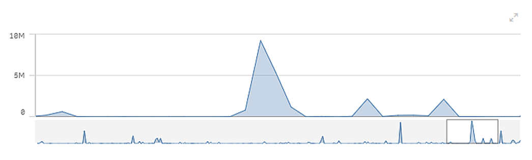
When the number of dimension values exceeds the width of the visualization, a mini chart with a scroll bar is displayed. You can scroll by using the scroll bar in the mini chart, or, depending on your device, by using the scroll wheel or by swiping with two fingers. When a large number of values are used, the mini chart no longer displays all the values. Instead, a condensed version of the mini chart (with the items in grey) displays an overview of the values, but the very low and the very high values are still visible. Note that for line charts with two dimensions, the mini chart is only available in stacked area mode.
Displaying out of range values
In the properties panel, under Appearance, you can set a limit for the measure axis range. Without a limit, the range is automatically set to include the highest positive and lowest negative value, but if you set a limit, you may have values that exceed that limit. When a data point value cannot be displayed, due to the range limits, an arrow indicates the direction of the value.
When a reference line is out of range, an arrow is displayed together with the number of reference lines that are out of range.
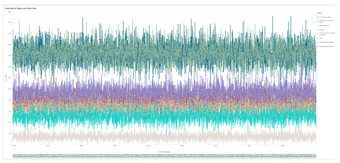
Displaying large amounts of data in a line chart
If the chart uses a continuous scale, you can set the maximum number of visible points and lines. In the properties panel, go to Presentation. Then adjust the following:
- Max visible points: Set the maximum number of points that will be displayed. The default is 2,000. The maximum is 50,000. If you set a number less than 1,000, the line chart will behave as if the maximum is 1,000 visible points. The actual maximum number of data points in the chart is affected by the distribution of the data, and could be lower than the value you configure with this setting. When there are more data points than the value you have set, data points are neither displayed, nor included in selections made in the chart.
- Max visible lines: Set the maximum number of lines that will be displayed. The default is 12. The maximum is 1,000.
If there are more data points than the number set in Max visible points, you will not see any points, only lines. If there are more than 5,000 visible points, then labels will not be shown. If you have a large number of lines, not all lines will be displayed, or lines may overlap.
If you have a large number of points or lines, it may take your chart longer to render when you zoom or pan. You cannot make selections when the line chart is rendering.
To avoid displaying limited data sets, you can either make a selection or use dimension limits in the properties panel.
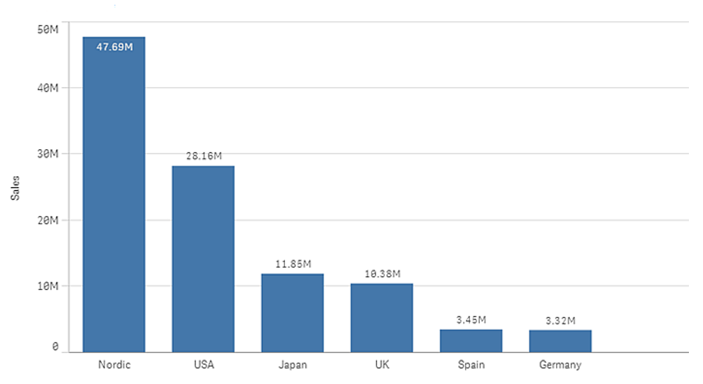
Bar Chart
The bar chart is suitable for comparing multiple values. The dimension axis shows the category items that are compared, and the measure axis shows the value for each category item.
Bar Chart– DEMO
For a brief demonstration, click here: https://help.qlik.com/en-US/sense/November2023/Subsystems/Hub/Content/Sense_Hub/Visualizations/Bar-Chart/bar-chart.htm.
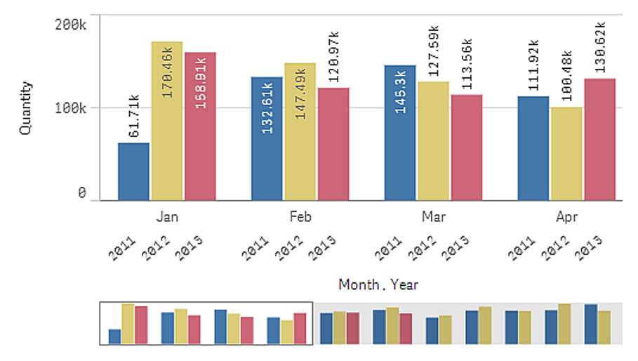
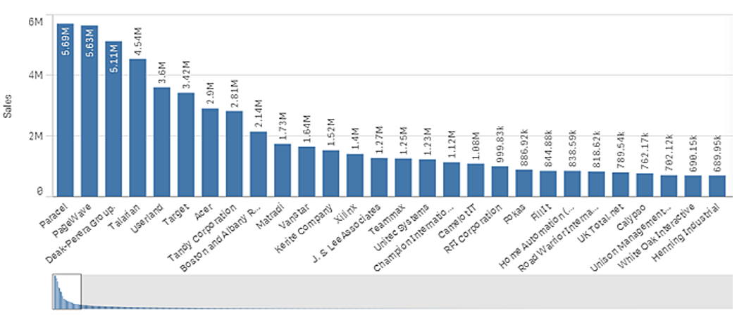
In the image below, the dimension values are different regions: Nordic, USA, Japan, UK, Spain, and Germany. Each region represents a dimension value, and has a corresponding bar. The bar height corresponds to the measure value (sales) for the different regions.
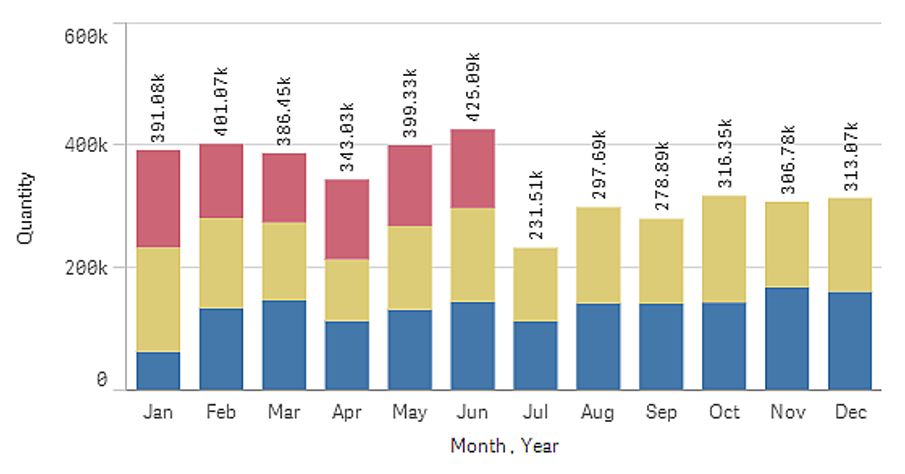
You can make more complex comparisons of data by using grouped or stacked bars. This requires using two dimensions and one measure. The two example charts use the same two dimensions and the same measure:
Grouped bars: With grouped bars, you can easily compare two or more items in the same categorical group.
Stacked bars: With stacked bars it is easier to compare the total quantity between different months. Stacked bars combine bars of different groups on top of each other and the total height of the resulting bar represents the combined result.
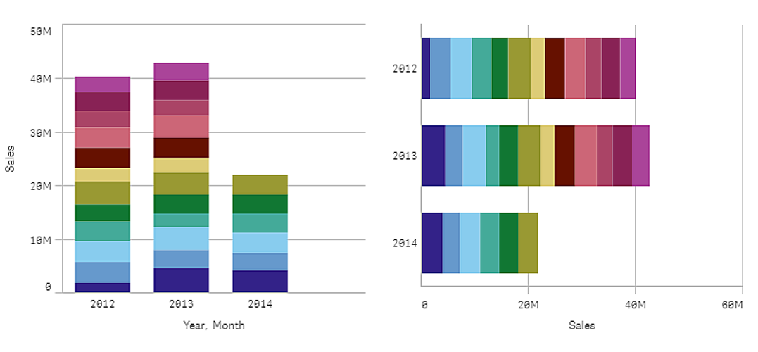
The bar chart can be displayed horizontally or vertically, as in the example below:
When to use it
Grouping and stacking bars makes it easy to visualize grouped data. The bar chart is also useful when you want to compare values side by side, for example sales compared to forecast for different years, and when the measures (in this case sales and forecast) are calculated using the same unit.
Advantages
The bar chart is easy to read and understand. You get a good overview of values when using bar charts.
Disadvantages
The bar chart does not work so well with many dimension values due to the limitation of the axis length. If the dimensions do not fit, you can scroll using the scroll bar, but then you might not get the full picture.
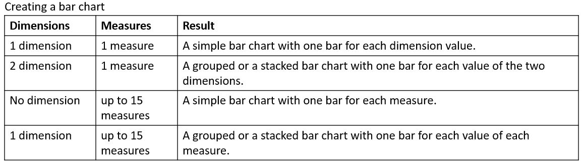
Creating a bar chart
You can create a simple bar chart on the sheet you are editing.
Do the following:
- From the assets panel, drag an empty bar chart to the sheet.
- Click Add dimension and select a dimension or a field.
- Click Add measure and select a measure or create a measure from a field.
In a bar chart you need at least one measure.
You can include up to two dimensions and one measure, or one dimension and up to 15 measures in a bar chart. Each bar corresponds to a dimension, and the values of the measures determine the height or length of the bars.
You can also create a bar chart with no dimension and up to 15 measures. In this case, one bar is displayed for every measure. The value of the measure determines the height or length of a bar.
When you have created the bar chart, you can adjust its appearance and other settings in the properties panel.
Styling the bar chart
You have a number of styling options available under Appearance in the properties panel.
Click Styling under Appearance > Presentation to further customize the styling of the chart. The styling panel contains various sections under the General and Chart tabs. You can reset your styles by clicking reset icon next to each section. Clicking Reset all resets styles in both General and Chart.
Customizing the text
You can set the text for the title, subtitle, and footnote under Appearance > General. To hide these elements, turn off Show titles.
The visibility of the different labels on the chart depends on chart-specific settings and label display options. These can be configured in the properties panel.
You can style the text that appears in the chart.
Do the following:
- In the properties panel, expand the Appearance
- Under Appearance > Presentation, click Styling.
- On the General tab, set the font, emphasis style, font size, and color for the following text elements:
- Title
- Subtitle
- Footnote
- On the Chart tab, set the font, font size, and color for the following text elements:
- Axis title: Style the titles on the axes.
- Axis label: Style the labels on the axes.
- Value labels: Style the labels which display the measure value for each dimension value.
When using the Stacked presentation option, this setting controls Segment labels (measure values for each dimension value) and Total labels (combines the measure values for each dimension value).
- Legend title: Style the title of the legend.
- Legend labels: Style the labels of the individual legend items.
Customizing the background
You can customize the background of the chart. The background can be set by colour or to an image.
Do the following:
- In the properties panel, expand the Appearance
- Under Appearance > Presentation, click Styling.
- On the General tab of the styling panel, select a background colour (single colour or expression) or set the background to an image from your media library.
When using a background image, you can adjust image sizing and position.
Customizing the bar segment outline and bar width
You can adjust the outline surrounding each bar segment in the chart, as well as the width of the bars.
Do the following:
- In the properties panel, expand the Appearance
- Under Appearance > Presentation, click Styling.
- On the Chart tab of the styling panel, under Outline, set the thickness and colour of the outlines.
- Adjust the slider for Bar width to set the width of the bars.
Showing or hiding dimensions and measures depending on a condition
You can show or hide a dimension or measure depending on if a condition is true or false. This is known as a show condition, and is entered as an expression. The dimension or measure is only shown if the expression is evaluated as true. If this field is empty, the dimension or measure is always shown. Expand the dimension or measure in the Data section of the properties panel and enter an expression under Show dimension if or Show measure if.
Information note: Custom tooltips are disabled for a bar chart if any of the dimensions in the chart are using a show condition.
Let’s say you have a dataset with the fields City, Manager, and Sales, among others. You could configure your bar chart so that aggregated sales are displayed along a dimension called City. You can add a second dimension, Manager, but only organize the data by this dimension if there are more than three manager names associated with your sales data.
Do the following:
- In edit mode, turn on the advanced options.
- Drag a bar chart from the assets panel onto the sheet.
- Add City as a dimension.
- Add Manager as a second dimension from the properties panel.
- Add Sum(Sales) as a measure.
- In the properties panel, expand the dimension Manager. Under Show dimension if, add the following expression: Count(distinct Manager)>3
If your data only contains two manager names, the bar chart will not organize sales by manager, since the expression is evaluated as false. If the data contains three or more unique Manager values, sales will be organized by both City and Manager.
Display limitations
Displaying large numbers of dimension values
When the number of dimension values exceeds the width of the visualization, a mini chart with a scroll bar is displayed. You can scroll by using the scroll bar in the mini chart, or, depending on your device, by using the scroll wheel or by swiping with two fingers. When a large number of values are used, the mini chart no longer displays all the values. Instead, a condensed version of the mini chart (with the items in grey) displays an overview of the values, but the very low and the very high values are still visible.
You can exchange the mini chart with a regular scrollbar, or hide it, with the Scrollbar property.
Displaying out of range values
In the properties panel, under Appearance, you can set a limit for the measure axis range. Without a limit, the range is automatically set to include the highest positive and lowest negative value, but if you set a limit, you may have values that exceed that limit. A bar that exceeds the limit will be cut diagonally to show that it is out of range.
When a reference line is out of range, an arrow is displayed together with the number of reference lines that are out of range.
Displaying large amounts of data in a stacked bar chart
When displaying large amounts of data in a stacked bar chart, there may be cases when not each dimension value within a bar is displayed with correct colour and size. These remaining values will instead be displayed as a grey, striped area. The size and total value of the bar will still be correct, but not all dimension values in the bar will be explicit.
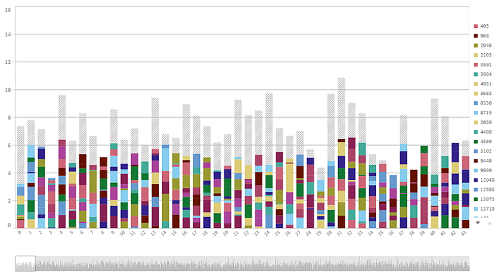
To remove the grey areas, you can either make a selection or use dimension limits in the properties panel.
The approximate limit for how many stacked bars that can be displayed without grey areas is 5000 bars, assuming that each bar consists of 10 inner dimension values and one dimension value and one measure value for the whole bar.
The initial data load is 500-dimension values or dimension stacks. (The value 500 refers to the outer dimension values, not each dimension value in a stack.) When you have scrolled past those 500 values, an incremental load is performed, where values are instead loaded based on the current view or scroll position.
Displaying large amounts of data in a bar chart with continuous scale
If the chart uses a continuous scale, a maximum of 2000 data points can be displayed. The actual maximum number of data points in the chart is affected by the distribution of the data. Above that number, data points are neither displayed, nor included in selections made in the chart. Additionally, only twelve-dimension values are displayed for the second dimension in a chart with two dimensions and continuous scale.
To avoid displaying limited data sets, you can either make a selection or use dimension limits in the properties panel.
For information about Qlik™, please visit this site: qlik.com.
For specific and specialized solutions from QQinfo, please visit this page: QQsolutions.
In order to be in touch with the latest news in the field, unique solutions explained, but also with our personal perspectives regarding the world of management, data and analytics, we recommend the QQblog !