The NL Insights object, found in the Qlik™ Dashboard ,bundle, allows app developers to add natural language generated insights to a sheet. The NL Insights object can be dragged to a sheet, just link other chart objects. Developers can use the NL Insights object to display an analytical summary of the data. This can accompany a single chart, a sheet, or the entire app. Once measures and/or dimensions are added to the object, narrative insights are automatically generated. The developer controls what data they would like to provide insights for based on their dimension and measure selections.
The image below is the Dashboard bundle.

Qlik™ Dashboard bundle
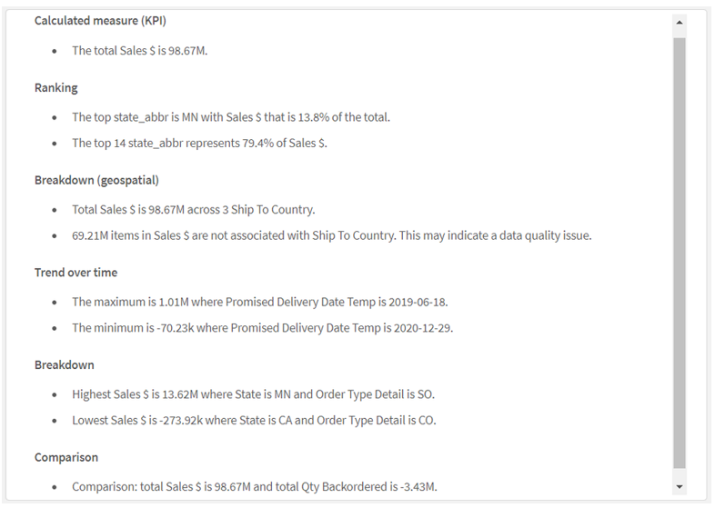
After adding the master measure Sales $ (as seen in the image on the left), the insights below are generated. This is an example of using the NL Insights object to provide overall insights for an app. By default, all appropriate analysis types are used to generate the insights based on the dimensions and/or measures selected, but the developer can modify these if they choose. Up to three dimensions and three measures can be added to a NL Insights object. If the combination of dimensions and/or measures does not return any insights, a message will be displayed.

Properties window > Data section
In the properties window, the developer can deselect any of the analysis types that they would like to remove from the auto-generated list. For example, in the image below, the selected analysis types can be removed by clicking on the “x” image next to the analysis type.
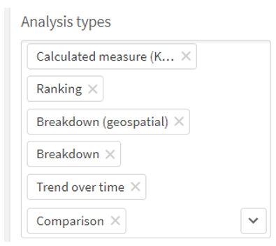
Properties window > Appearance section > Analysis types
According to Qlik™ Help, NL Insights can offer the following analysis types:
- Calculated measure
- Ranking
- Ranking (grouped)
- Breakdown (geospatial)
- Breakdown
- Overview
- Relative importance
- Year to date
- Trend over time
- Comparison
- Correlation
- Process control (means)
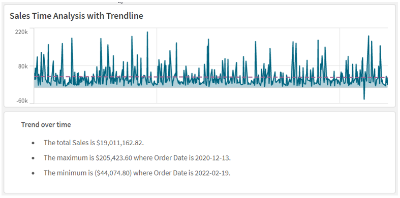
Natural language insights can also be used to accompany a specific chart. In the example below, a NL Insights object has the same dimension and measure that the line chart has and is used to provide a narrative of the chart. This can be useful to highlight important information. In this example, the style is set to bullet points, but it can also be set to sentences. Developers also have the option to set the verbosity to full or brief to show all recommendations or just the top recommendations. This example has verbosity set to full. Like other objects, insights are updated when selections are made in the app.
Users can benefit from NL Insights – a native capability that provides AI generated insights to users. Developers can give users a narrative summary of a chart, a sheet, or an app, to supplement visualizations in an app. A few things to note about the NL Insights objects – you can have up to three NL Insight objects on a sheet and if you add a new master item to your app, you will need to refresh the app before the new master items can be used in the NL Insights object. Try the NL Insights object out in your next app.
For a brief demonstration, please watch the video below!
For information about Qlik™, please visit this site: qlik.com.
For specific and specialized solutions from QQinfo, please visit this page: QQsolutions.
In order to be in touch with the latest news in the field, unique solutions explained, but also with our personal perspectives regarding the world of management, data and analytics, we recommend the QQblog !