

In this release, several additions have been made to Insight Advisor Chat, including improved question answers (NLG), a refined user interface for question analysis, and smarter app selection when answering questions.
Conversational Analytics API – The API allows developers to build their own client for Insight Advisor Chat into the applications and/or enterprise chat platforms available where chat add-ons are included.
Several improvements have been made to search-based analytics within Qlik Sense™ applications in terms of:
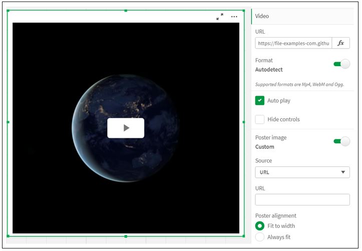
A new ability to embed and play videos directly in Qlik Sense™ applications has been released.
The Video Player allows you to play videos in different formats from external sources. It is included in the Dashboard package. The following video formats are supported: MP4, OGG, WEBM, YouTube.
The Video Player is useful when you want to include a video in your app. For example, you want to show a demonstration or training video, add a tutorial or present corporate news.
You can add a video player to a file you are editing. Add or assign a video link in the video object. The video is streamed from a source, not uploaded to Qlik Sense. By default, the video format of the link will be automatically detected, the video will not automatically play, and video controls will be available to application users.
The video options are set in the Properties panel.
Improved capabilities have been added to the grid dimensions for your views, which helps you better identify the location of the graphic and the dimensions associated with the image design. There is a new indicator in the bottom right of an object that contains these added dimensions and coordinates when you move or resize graphic objects on the design canvas.
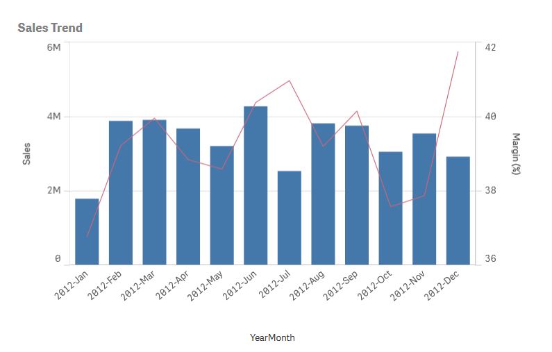
The Combo Chart is now available, new and improved, with expanded functionality including vertical presentation, measurement and dimension based reference lines and line and bar style.
The Combo Chart is suitable for comparing two sets of measurement values that are usually difficult to compare due to scale differences. It is basically a bar chart combined with a line chart.
A typical example is when you have a bar chart with sales figures and you want to combine these figures with margin values (in percent). In a typical bar chart, the sales bars would be displayed as usual, but the margin values would be almost invisible because of the very large difference between the numerical values for sales and margin.
Combo Chart with margin values (in percent) and bars with sales figures.
With a Combo Chart you can combine these values, for example using bars for sales values and a line for margin values. By default, the bars have the measurement axis on the left and the margin values have a separate axis on the right. The two measures use the same dimension (Year/Month)
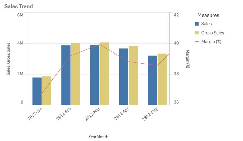
If you have yet another measure, e.g. gross sales, with values that are roughly in the same range as the sales values, you can add the third measure as bars and stack or group the new measurement values with the sales values. With grouped bars, you can easily compare two or more items in the same categorical group. Stacked bars combine bars of different groups on top of each other and the total height of the resulting bar is the combined result.
Combo Chart with three measures; margin values (in percent), bars with sales figures and gross sales measure grouped with sales values.
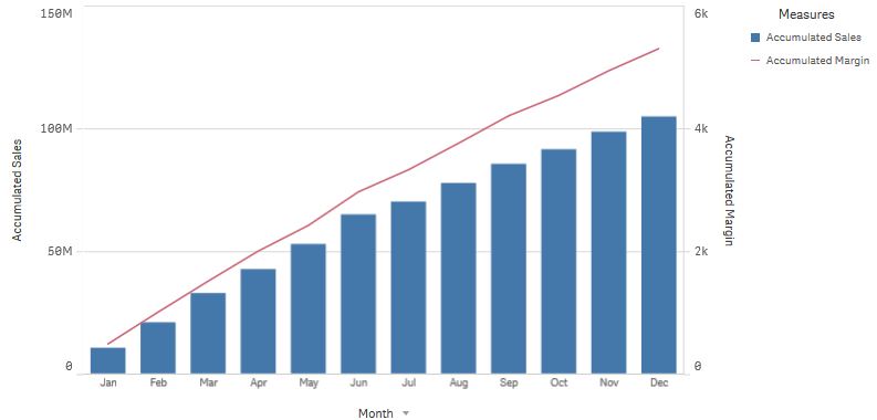
You can accumulate values of a measure on one or two dimensions.
Combo Chart with two accumulated measures, accumulated margin values and bars with accumulated sales figures.
With the ability to have different measurement scales, one to the left and one to the right, the Combo Chart is ideal when you want to present measurement values that are normally difficult to combine because of the significant difference in ranges.
But a Combo Chart can also be quite useful when comparing values from the same range of values. In the picture above, the combo chart has only one measurement axis, but the relationship between the two categories of sales and cost is clear.
The Combo Chart is the best choice when combining several measures of different ranges.
The Combo Chart supports only one dimension and therefore cannot be used when you need to include two or more dimensions in the view.
You can create a Combo Chart in the sheet you are editing and you need at least one dimension and one measure.
When you have created the Combo Chart, we recommend that you adjust its appearance and other settings in the properties panel.
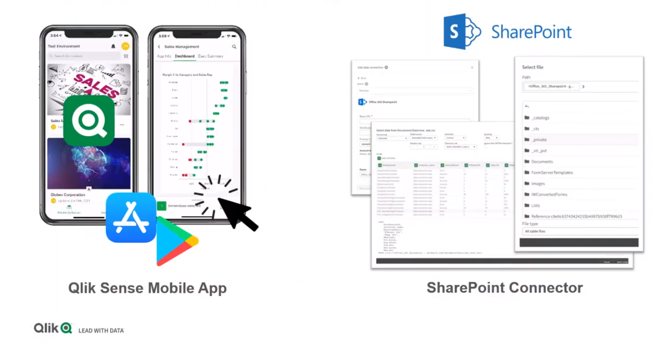
This month Qlik™ introduced a new Qlik Sense™ mobile app and sharing connector.
The native Qlik Sense™ mobile app can be downloaded to your mobile device from the Apple Store for iOS or Google Play for Android.
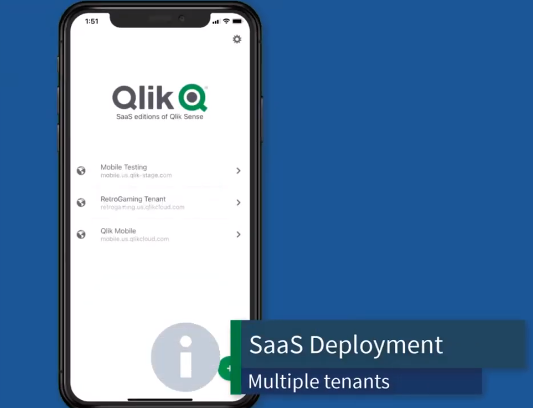
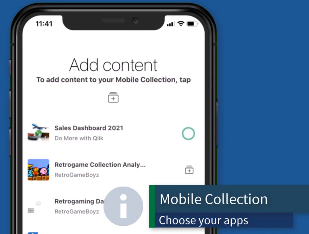
Once installed, you simply connect to Qlik Sense™ Enterprise or Business SaaS Tenants. Create a collection of available applications you want to access from your device and you’re ready to go.
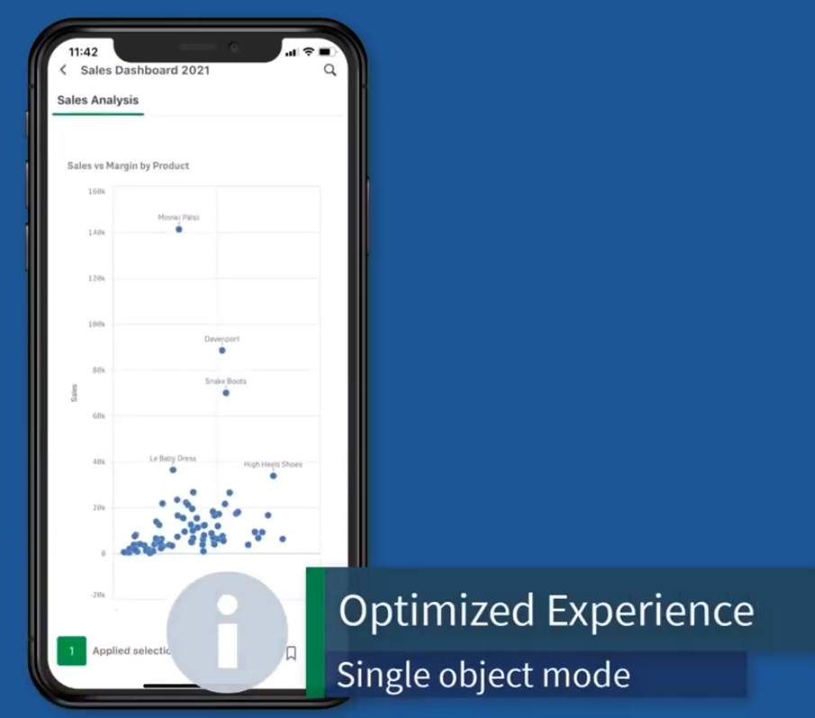
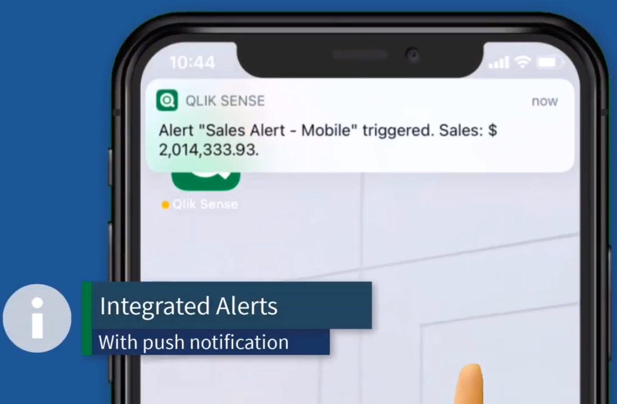
With the new Qlik Sense™ mobile app, you get a next-generation optimized user experience for both online and offline analytics and even integrated data alerting.
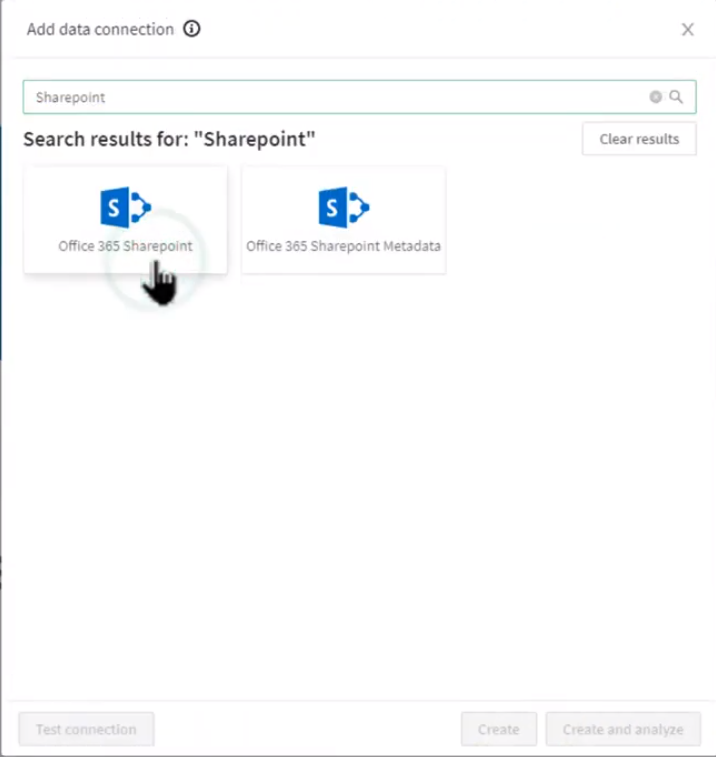
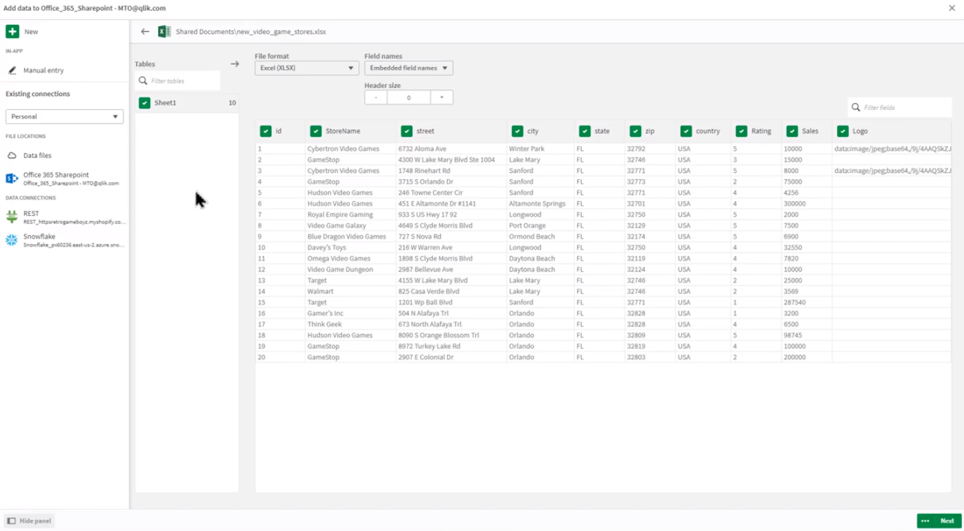
A new sharing connector has also been added that allows Qlik Sense™ Enterprise SaaS users to navigate the Office 365 access point hierarchy structure to access Qlik Sense™ supported data files.
For a demonstration of this new app, please watch a short video here:
For information about Qlik™, please visit this site: qlik.com.
For specific and specialized solutions from QQinfo, please visit this page: QQsolutions.
In order to be in touch with the latest news in the field, unique solutions explained, but also with our personal perspectives regarding the world of management, data and analytics, we recommend the QQblog !