What is a Financial Dashboard ?
A financial dashboard is a business intelligence tool that allows finance and accounting teams to track and report on financial KPIs. Modern dashboards go beyond simple data visualization and reporting by leveraging a finance analytics platform to synthesize disparate financial and accounting data and allow analysts to explore the data and find insights that will reduce costs and improve profitability more deeply.
Explore the dashboards to a whole new level with Qlik™ !
The ability to deliver flexible, best-in-class dashboards is just one-way Qlik Sense™ sets the benchmark for a new generation of cloud data analytics technology. The unique associative analytics Qlik™ engine and sophisticated AI empowers people at all skill levels to freely explore data, make bigger discoveries and uncover bolder insights they cannot find using other analytics tools. With Qlik™, you can support nearly any use case and massively scale users and data, empowering everyone in your organization to make better decisions every day.
Move beyond monitoring and reporting !
Dig into your dashboards to get insights that lower costs and increase profitability with these best practice examples !
Key Capabilities of a Financial Dashboard
The best financial dashboard goes beyond simple visualization. It makes it easy to leverage powerful finance analytics and explore and analyze in a undefined fashion within the dashboard itself. First, the dashboard combines multiple sources of data to provide a complete and accurate financial picture. Then it enables finance and accounting teams to explore this unified, real-time data in any direction, directly from within the dashboard.
This not only streamlines financial reporting, it puts the power of sophisticated data analytics for advanced forecasting, budgeting and planning directly into the hands of financial analysts. This way, they spend more time identifying ways to reduce costs and increase profitability and less time preparing data as they do with spreadsheets.
Financial Dashboards for Data-Driven Decisions
Below are 12 examples that demonstrate key capabilities of a modern financial dashboard. Sophisticated business intelligence tools make it easy for anyone to create their own dashboards, including popular metrics not included here, such as Return on Assets, Return on Equity, Debt-Equity Ratio and Working Capital Ratio.
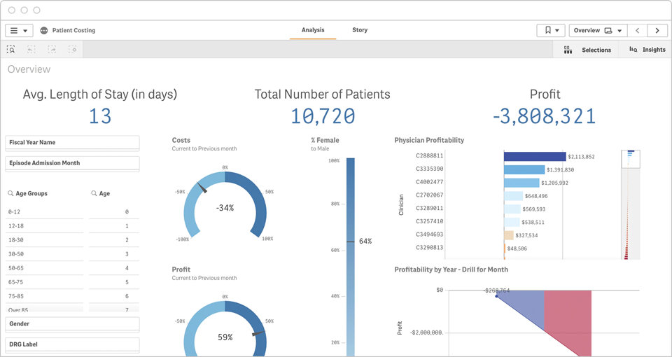
1. CFO Dashboard
A CFO dashboard needs to integrate data from multiple systems to give a complete picture of an organization’s performance. This example for a healthcare organization combines data from patient records, finance, and operational systems to present cost profiles for physicians and even allows a CFO or their team to drill down to an individual patient level and the resources which were used to treat those patients.
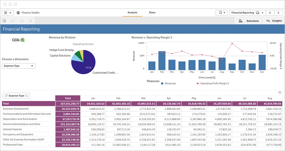
2. Financial Reporting Dashboard
A financial reporting dashboard gives a high-level visualization of KPIs such as revenue by division and revenue vs operating margin over time. This dashboard should be easily customizable and also allow for detailed analysis of variables such as expense type so that finance managers can monitor and manage expenses in real-time.
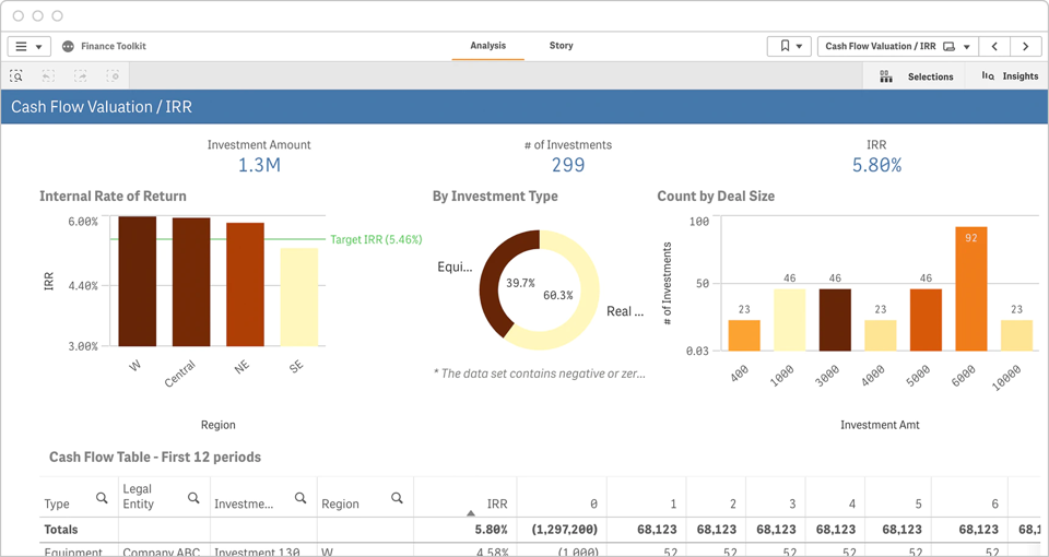
3. Cash Flow Valuation Dashboard
This example shows how a dashboard leverages functions of finance analytics software to present and allow analysis of internal rate of return by region against a target IRR, the number of investments by type and a detailed cash flow table.
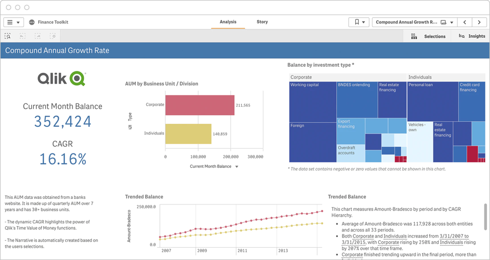
4. CAGR Dashboard
A financial institution such as a bank, mutual fund, venture capital firm, or broker would design a financial dashboard that shows AUM (assets under management) by business unit or division and balance by investment type. Displaying the dynamic CAGR (compound annual growth rate) over multiple time periods demonstrates the Time Value of Money function of the underlying finance analytics platform. A sophisticated financial dashboard can even automatically generate a narrative based on the user’s selections.
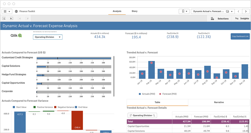
5. Actual vs. Forecast Expense Dashboard
Finance professionals need to quickly understand how actual expenses compare to forecast for a given time and trending over time for each expense type. A modern, integrated financial dashboard also makes it easy for them to drill into the data and gain actionable insights.
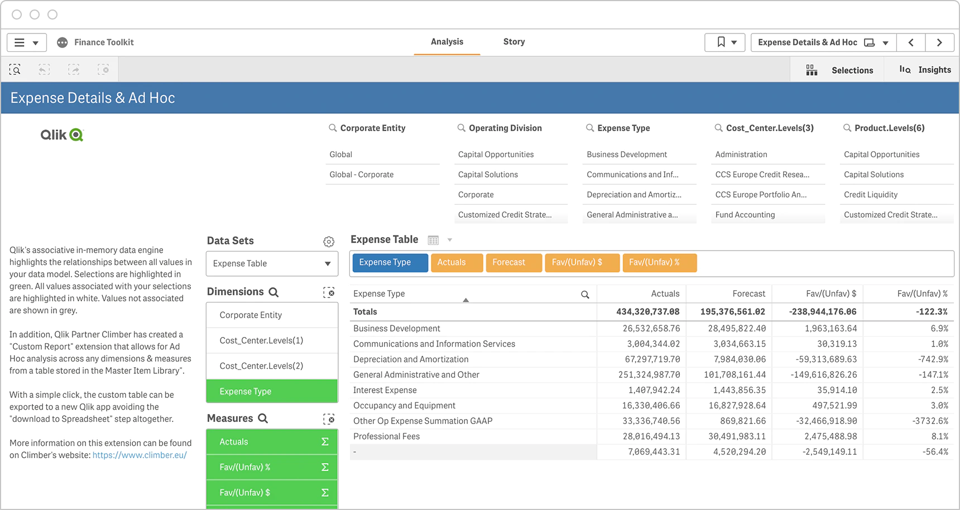
6. Expense Detail Analysis Dashboard
An advanced financial dashboard taps into an analytics engine which allows users to easily explore the relationships between all values in their data model such as divisions, expense types, cost centers and products. This kind of ad hoc analysis across any dimensions brings powerful insights and with a simple click the custom table created in the dashboard can be exported to the finance analytics platform for future reference.
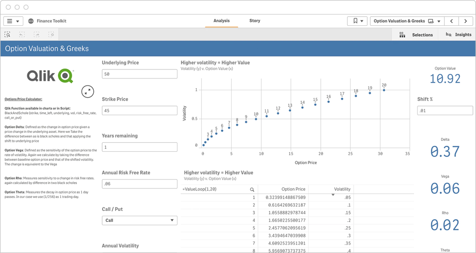
7. Option Valuation and Greeks Dashboard
This powerful financial dashboard is a full featured options price calculator with functions such as Black and Schole available in the charts. By entering different input values, financial analysts can quickly see the relationship between volatility and option price and get values for option delta, vega, rho and theta.
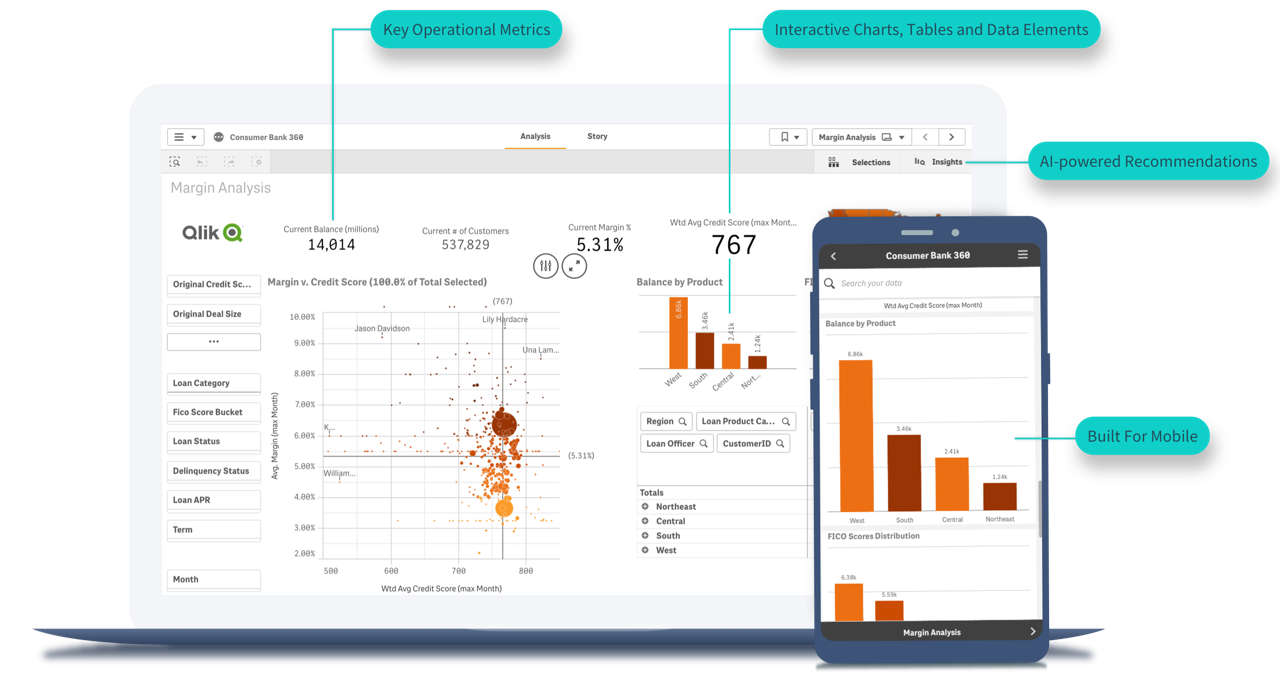
8. Margin Analysis Dashboard
Loan managers at consumer banks need interactive dashboards that contain loan portfolio data. This financial dashboard example allows them to discover how different regions, product and loan officers perform over time and drive the biggest impact on revenue and margins.

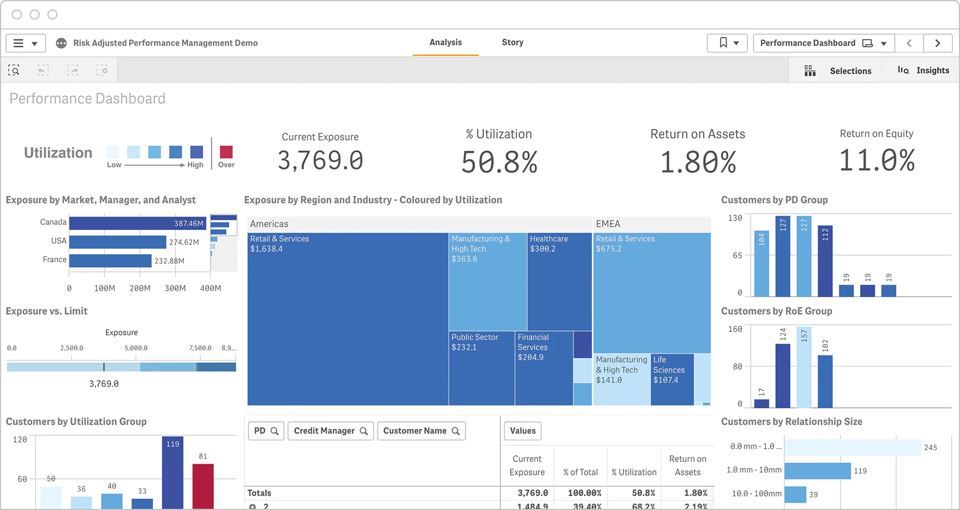
9. Risk Adjusted Performance Dashboard
This performance dashboard allows financial professionals to analyze commercial loan portfolios and gain insights into improving Return on Equity and Return on Assets. Color-coded charts provide at-a-glance understanding of utilization and exposure by region, industry, and customer.
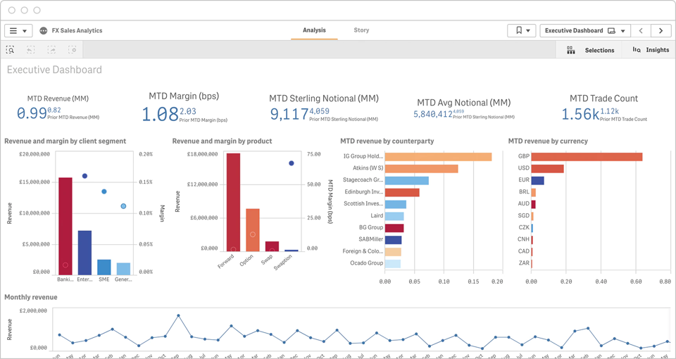
10. FX Sales Analytics Dashboard
Currency trading managers need a financial dashboard that provides trading volume, margin, revenue, and currency data. Plus, they need all key measures to be drillable by client segment, product group, counterparty, and currency.
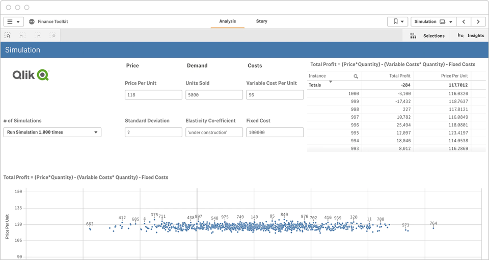
11. Profit Simulations Dashboard
This financial dashboard example allows analysts to evaluate the relationship between price per unit and total profit. The analyst can enter values for price, demand, variable cost per unit, standard deviation, elasticity, and fixed cost and then run simulations from 100 to 1,000,000 times to produce a visualization that they can drill into and explore further.
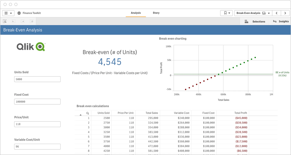
12. Break-Even Analysis Dashboard
Break-even analysis helps a company make investment decisions and set prices. Using this dashboard, analysts can enter units sold, fixed cost, price per unit and variable cost per unit to produce a chart that maps the relationship between total profit and total sales.
For information about Qlik™, please visit this page qlik.com.
For QQinfo solutions, please visit this page QQsolutions.