Selection of some recent impactful enhancements
Page Content
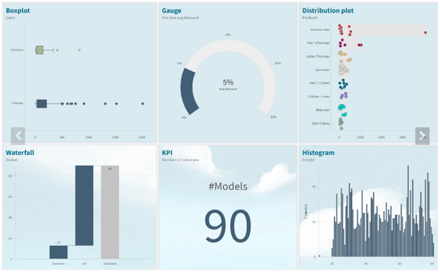
We’ve been releasing improvements to Qlik™ Data Visualizations on Qlik™ Cloud Analytics (Qlik Sense™ SaaS) at a furious pace – more than 200 in the past two years. It might be difficult to keep up with all the updates. So, we provide a quick recap of some recent impactful enhancements to help you get up-to-speed so you can introduce new use cases and leverage all the beautiful and powerful visualizations Qlik™ has to offer.
Styling
Qlik™ is in the process of rolling out a major chart styling overhaul, which is almost complete. The goal here is to boost your ability to customize the look and feel of your charts and objects to dramatically improve usability, flexibility, and visual appeal. A new Styling Panel has now been incorporated into almost all visualization components, extending your ability to customize per organization, department, or personal style standards and preferences.
You can tailor:
- Font size, color, and font family
- Covering titles, subtitles, footnotes, plus Axis and Value labels in your charts and objects
- Background image or color
Qlik™ plans to complete the implementation of the Styling Panel for all native Qlik™ Cloud Analytics charts, tables, and objects in the coming months.
Backgrounds
Backgrounds can be used divide your dashboard into sections for clarity, to comply with your organization’s branding, or to simply beautify your visual presentation. Available for almost all charts, you can choose a single color, color by expression, or an image from a media library. Here you can find more information on Backgrounds.
Themes
Custom themes provide complete styling control, allowing you to alter color, images, spacing, plus the ability to define color palettes. This is supplemental to the current default themes available in Qlik™ Cloud Analytics: Classic, Focus, Breeze, and Horizon. More information on Themes can be found on Qlik Help.
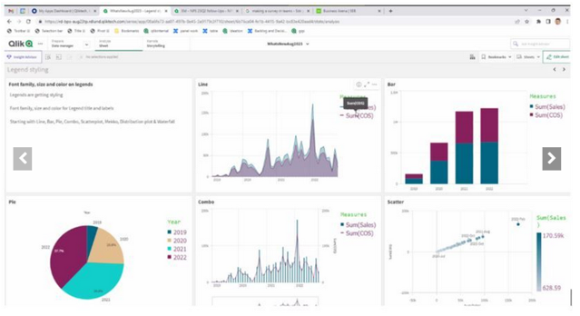
Legend
New styling options for the Legend Object are now available, providing greater flexibility and customization. Legend styling is available for Line, Bar, Pie, Mekko, and Waterfall charts, plus Scatterplot and Distribution Plot. Options for Legend styling include font family, size, and color for Title and Labels.
Animations
The Animator is useful for enabling users iterate through dimension values over a period of time. They can iterate over any dimension and simulate selections through animations.
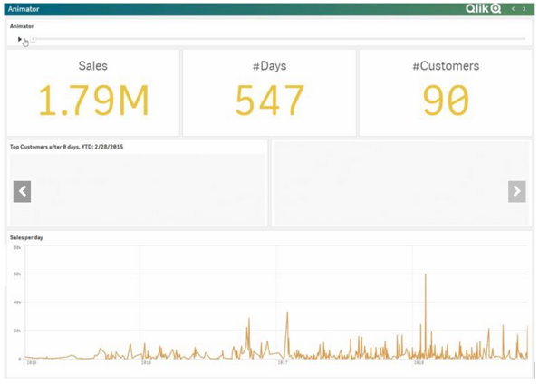
For information on creating an animation, please watch the video below:
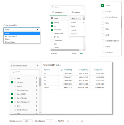
New Straight Table
The new Straight Table acts as a catch-all, which allows users to pick and choose which columns are presented without requiring them to go into edit mode. As a developer, you can add many fields simultaneously, alternate dimensions and measures, and define column width, including fill, auto, pixels and percentage options. Also store the layout as a bookmark and utilize pagination/virtual scroll. Plus, you can now leverage chart monitoring, snapshots, and download as image and PDF. The new Straight Table is currently available in the Visualization Bundle and will be available in native Qlik™ Cloud Analytics later. Information on the Straight Table can be found here.
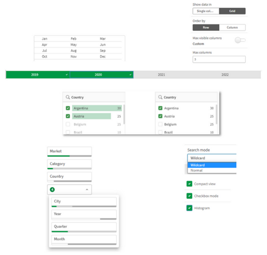
New Filter Pane
The new Filter Pane is a highly requested feature improvement. Similar to the List Box from QlikView™, the new Filter Pane includes a grid layout, allowing you to choose the horizontal placement. It also provides several new capabilities, including grid mode, search mode (with wildcard option), checkbox mode, compact view, and histogram. More information on the Filter Pane can be found here.
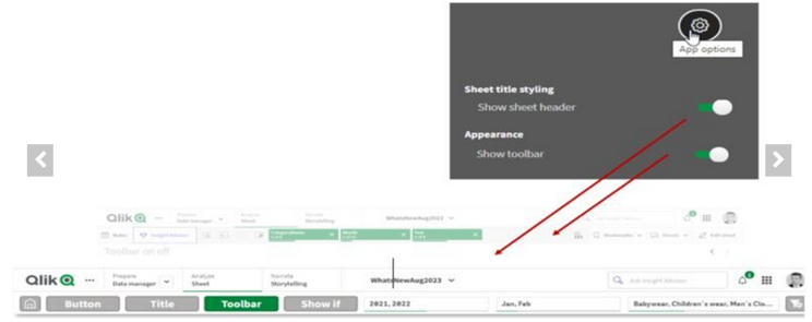
Show/ Hide Customization
New application styling settings in “App options” allow you to turn the Toolbar and Sheet Title on or off for all sheets. Turning the Toolbar and/ or Sheet Title off provides more space for content and allows you to customize selections for titles and the navigation bar.
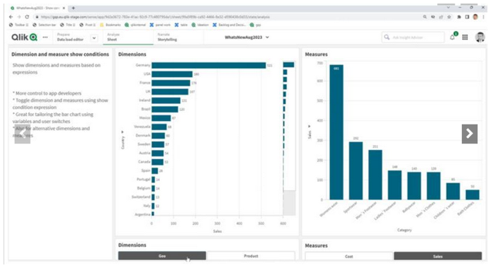
Show Conditions for the Bar Chart and Line Chart
In addition, new options for the Bar Chart and Line Chart allow application developers to enable toggling across different dimensions or measures within the same chart. The ability to add a simple toggle switch using the “show condition” expression gives developers more control, improves customization, and saves space. Users will appreciate significant time savings with the ability to toggle across the variables associated with their Bar and Line Chart data.
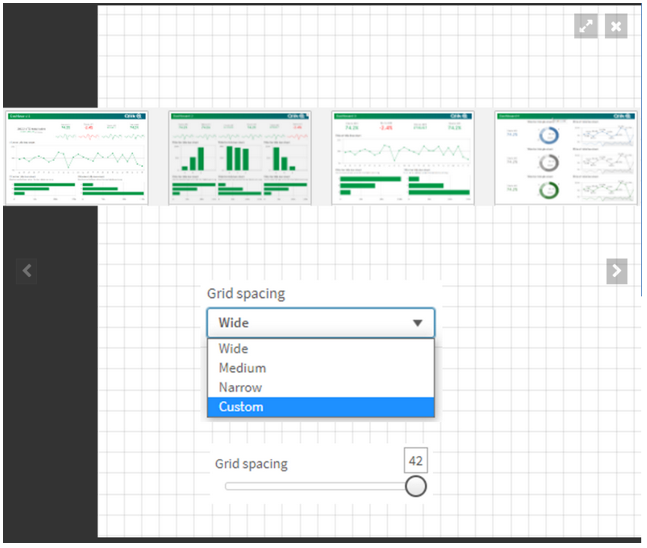
Granular Grid
The Qlik Sense™ canvas is based on a grid concept, which is frequent in web design, as it provides support to position images and account for padding. Options for the Qlik™ Cloud Analytics granular grid include wide, medium, and narrow, and now also custom (up to 42 grids wide). Qlik Help provides more information on the granular grid.
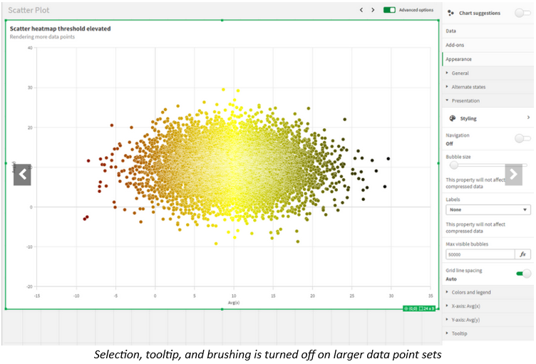
Data Points in Scatter Plot
One of the top requested improvements, the updated Scatter Plot in Qlik™ Cloud Analytics provides greater flexibility and customization, including an increased threshold to show more points at a time and heat map mode. You can modify the threshold to render more plot points – zoom and pan adjusts for large volumes. Information on creating Scatter Plots can be found here.
Data Points in Line Chart
Likewise, based on customer feedback, Qlik™ has extended the number of data points that can be shown on the Line Chart. This boosts the flexibility and scalability of the Line Chart. More information on Line Charts can be found on Qlik Help.
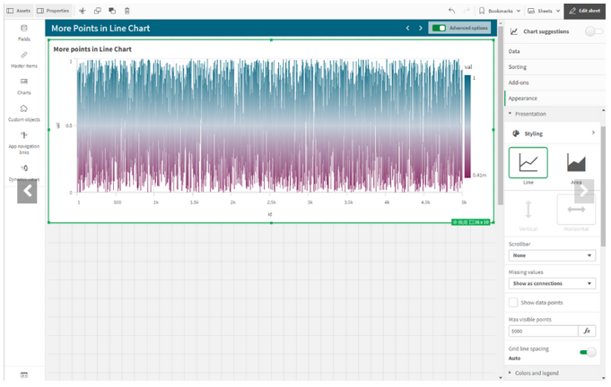
Chart Function
Working within the Qlik™ Engine object hierarchy, the new functions: ObjectID() and InObject() allow you to query and work with the ID of objects. This is a Qlik Sense™ variant of the QlikView™ function GetActiveSheetID(). For example, you can retrieve the current sheet ID in an expression. This simplifies the creation of custom navigation buttons, previously a tedious process. These chart functions were highly requested by customers. You can find more information here.
For information about Qlik™, please visit this site: qlik.com.
For specific and specialized solutions from QQinfo, please visit this page: QQsolutions.
In order to be in touch with the latest news in the field, unique solutions explained, but also with our personal perspectives regarding the world of management, data and analytics, we recommend the QQblog !