Page Content
What’s the latest news in Qlik Sense™?
All these new features are part of a wider project to improve the look and feel. Qlik™ experts are currently working on new and improved tables, as already seen in the new Straight table, and perhaps the biggest change is the ability to choose, without going into edit mode, the sizes and measures you want to analyze.

So, it’s a bit of a catch wall to serve a variety of different users. The next major update to the table will be a multi-page PDF export for all the other charts and the prior table. Now only the current view can be exported, but with the new table we will be able to create multiple pages of PDFs.
It was added the settings for the sheet background, settings to make the grid more fine-granular, so you can move things around more precise.

Also, there were added images and colors to the chart backgrounds, and also the access font styling was improved.


It is allowed to set a different font on the access label of a chart versus the title go into a chart, on the presentation, under styling, for each there’s a general section that applies to basically all charts, like the title, subtitle, and footnote.
And then you have additional styling specific to that type of short. So, you will be able to set the axis title, axis label, in this case for the bar chart, value labels, Legend title, and Legend Labels, also to set the color and the size and the font family.

This has been possible to do with a custom theme. Now there are provided both options. We can now switch off the sheet title and the toolbar. There’s this one called Show Toolbar and the other one is Show Sheet Header, but we will also be able to change more of the look and feel of this standard top bar, that you can see, it gives you more screen state to do whatever you want.

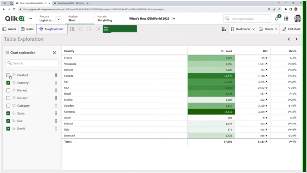
The filter panes look pretty much the same for many years, but now we have lots of more abilities to line them up in a grid mode.

We have the histogram mode and the compact View mode. You can turn them into checkboxes or into radio buttons.

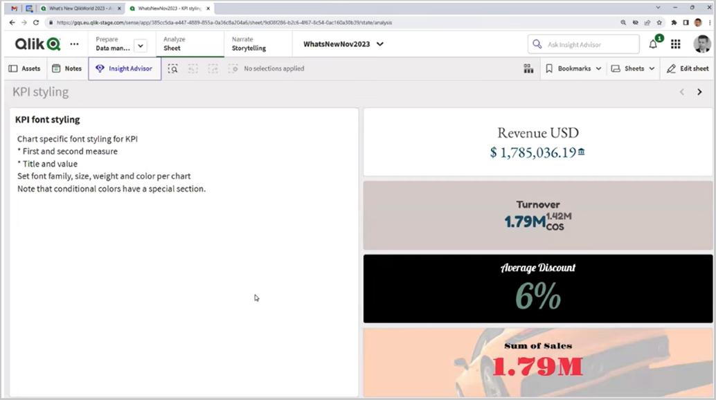
You might have noticed that the line object that appeared not long ago, It’s a way to style and add dividers and decorations to your dashboard. It was added the font styling also to the KPI object.

All of these visualizations’ improvements, they end up in the Cloud first. And then Qlik™ round up all these changes for the on-premise releases which are 4 times a year.
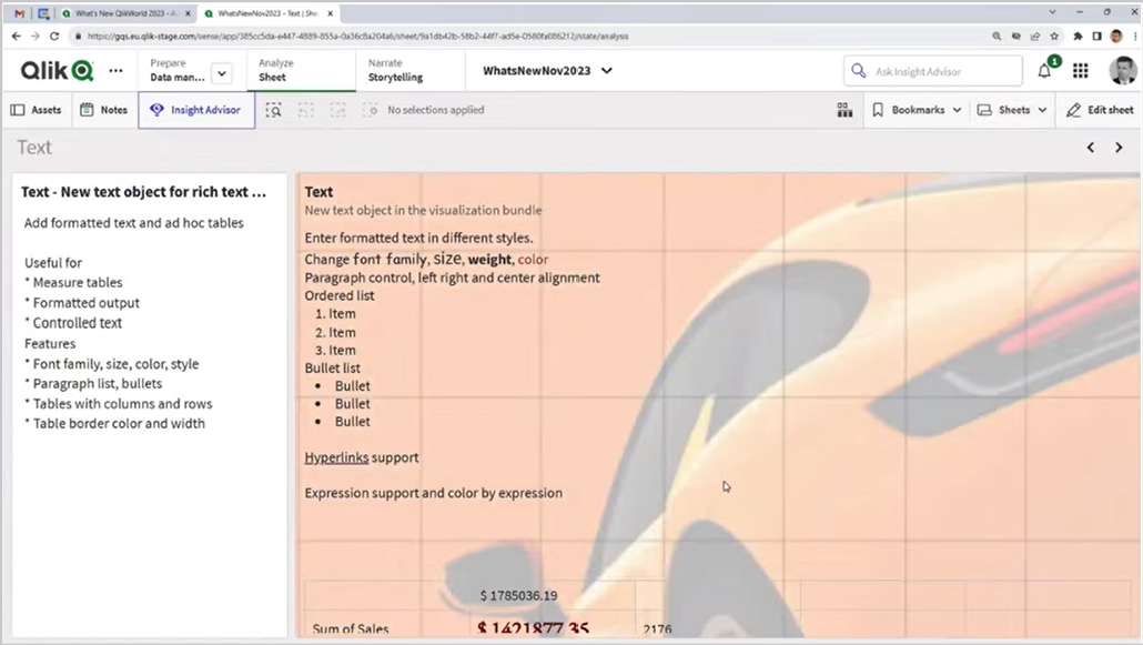
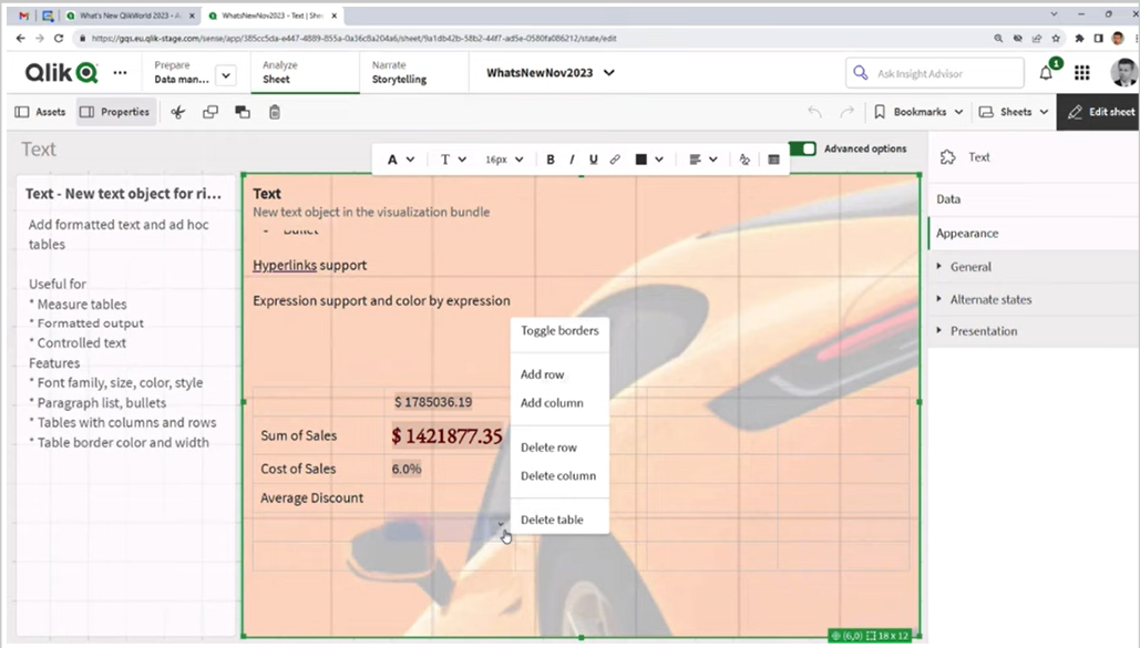
The new Text Object it’s a rich text object replacing the text and image object, and it’s more like a rich text object that you can find in Confluence or Miro, where you can change the font family, size, and weight in color, you can change the paragraph control, you can also have order list, and bullet lists that you could create just for formatting purposes.


You can add a table to your chart and then you can decide whether how many rows and columns, whether it should have borers. It’s not like a standard Sense table, where you make selections, it’s more useful for doing formatting and perhaps creating this ad-hoc metrics table.
New Layout Container feature and how it works
Qlik™ will introduce a cool new feature, the Layout Container that is really a big thing that will come in this year.
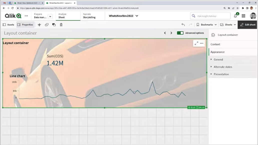
The way it works gives you the ability to arrange objects, to stack them, so that objects can be on top of each other. You can decide their order, and you can use the new settings for background color, whether you want to have the same background or a transparent background.

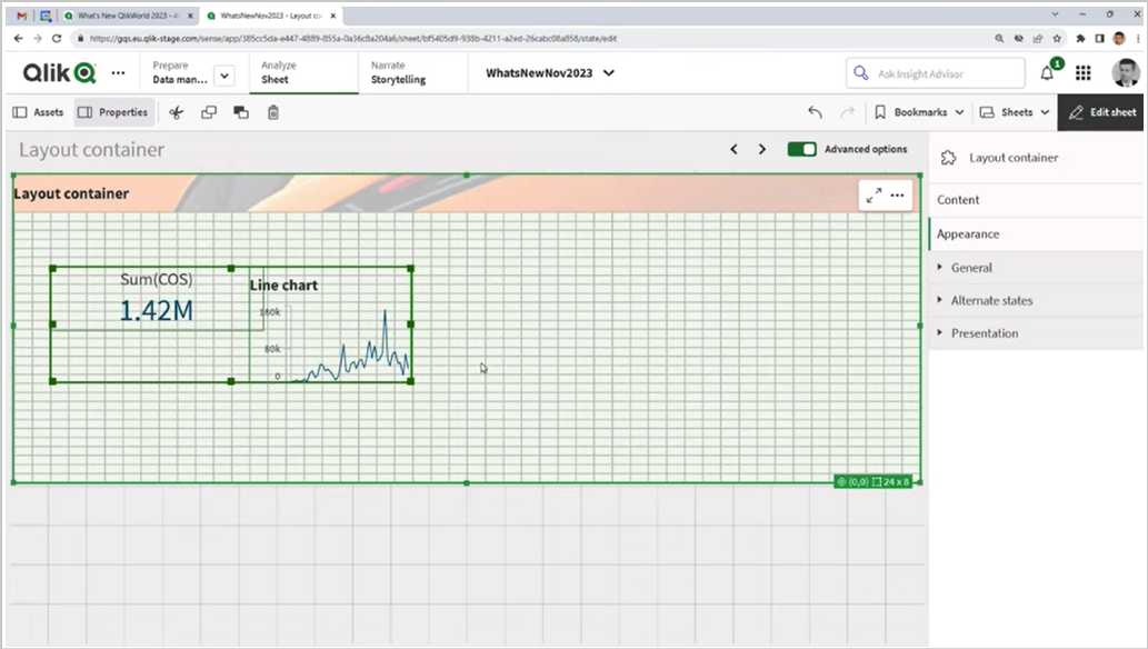
When you move things around, you get guidelines, and you can select multiple things at the same time. So, it’s a major big change, and of course, with great power, comes great responsibility. You have a lot of options, but you also have possibilities of things going wrong.
Best practices for how to use the new Layout Container
1. Don’t go off grid
It’s really important to stick to a consistent approach so that objects are laid out in a beautiful way that’s easy to navigate (example from BBC site).

2. Always use odd numbers
If you imagine that being arranged on a plate in a two, it just wouldn’t quite look right, and also, we have to consider that in terms of how we’re laying out objects. So, this is a simple example where it has just been put two KPIs over a line chart.

That looks OK, but actually 3 just somehow looks more complete.
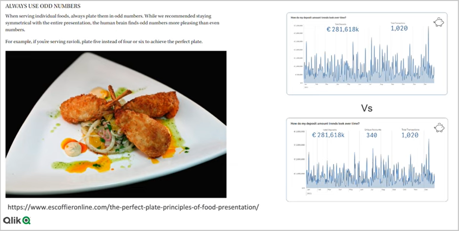
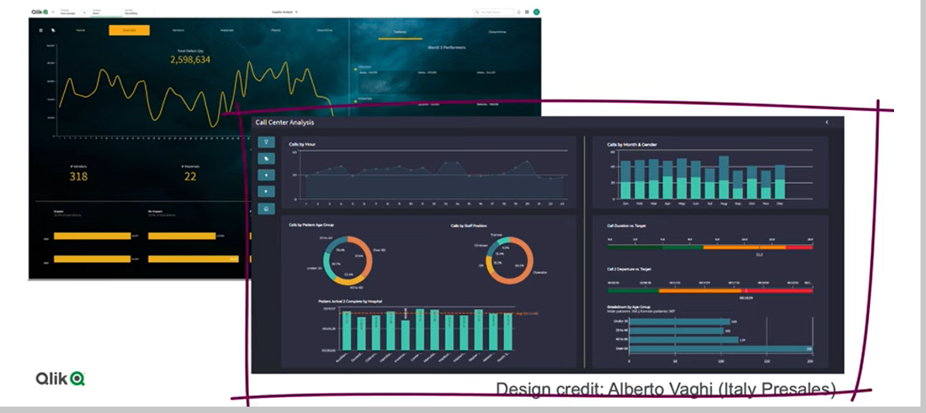
We present you below a good example of a chart, both sticking to a grid, as well as doing things in 3s.

It was laid this out with 3 kinds of specific containers, and then within each of those containers are a variety of objects and a sidebar as well. So, that might look like 4, but actually that’s a consistent navigation object that’s been built on the side there. This is just a simple example of how you can stick to a grid, and you can use an odd number of containers, and this is quite pleasing to the eye.
3. Image is everything
It’s really important through the use of color, like in this example below, where it is chosen a very dark background, and then just to delineate each of the objects, it has been used slightly lighter shades of black to then demarcate each of the objects onto the background. So, think carefully about how you use Line Objects, background images, and so on, and some of the icons, etc., and try to use common icons that people can easily work with, especially when for example, building sidebar navigation, that type of thing.
4. “Simplicity is the key to brilliance” – Bruce Lee
Now, you’ve got this ability to overlay objects, there’s a real temptation to cram in lots and lots of KPIs and different charts, and so on. And we need to really be focusing on the key business questions: Why are the users trying to log into that screen and not trying to do many things in one place? What we’d really like to do is: build a very nicely curated space that’s been thoughtfully laid out and designed. And generally, we would say that 4 charts on a single screen, maybe 5 (sticking to our odd number rule), but 4 or 5 charts is about the maximum we want to put on a screen.

5. Just because you can, it doesn’t mean you should
When you move from working with QlikView™ to Qlik Sense™, it’s a great fact that you could very quickly just drag and drop objects onto screen in Qlik Sense™. You can just very quickly place objects on a screen, visualize them and actually get some of the important data Insights very quickly. For a lot of users, where you’re just building dashboards for yourself or a very small audience, probably you wouldn’t look to use this Layout Container, because it’s going to take up a lot of time. However, if you’re building a central dashboard, then it probably is worth investing the time, using a Layout Container, coming up with some really kind of high-impact bespoke designs, and so on. Just because now, you have the Layout Container, doesn’t mean you should always use it. Just keeping things simple, and quick, and easy also has its advantages.
It’s really important to think carefully about your color palette, but also when you’re using background images, make sure that those images aren’t interfering with the reading of the dashboard. If you deploy it in the right circumstance, it can really kind of wow the users, and that is going to take you a lot of time, so, invest that time carefully.
The power of Bookmarks
You will see in the video below how to create a bookmark, to set as default bookmark and to use bookmarks.
Also, you can see how to pre-apply a selection when users open the app.
For instance, if you are going to go and select an year, you are going to go into bookmark, and you will create a new bookmark Latest Year, and once it’s saved, right-click here on it, Set as Default. That means that whenever another user comes into the app, once you’ve publishes it, the first time they open a session to the app, this is the bookmark that will be selected.


This option, to Set Bookmark as Default, has been around for the latest 6 or 7 years.
Further on, we invite you to watch some demonstrations of those above, by watching the video below from the last Techspert Talks Session in early October, where Qlik™ experts shared details about the latest and upcoming features in Qlik Sense™ interface.
Chapters:
01:59 – New Straight Table
02:45 – Background Images, Fine Grid, Font Styling
03:45 – Turn off Sheet Title and Tool Bar
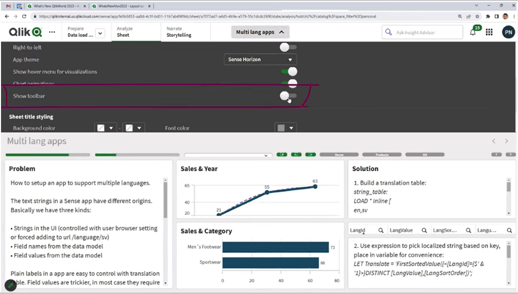
04:06 – Multi-Language App
04:41 – New Filter Panes
04:58 – Line Object
05:34 – New Rich Text Object
06:20 – Layout Container
07:21 – Tip 1: Don’t go off grid
07:43 – Tip 2: Best things are odd, example app
09:26 – Tip 3: Image is everything, example app
12:15 – Tip 4: Simplicity
12:58 – Tip 5: You can, you don’t have to
15:03 – Setting Default Bookmarks
16:34 – Creating Dynamic Bookmarks
17:46 – Search Expression Best Practices
18:44 – Update Bookmark
20:00 – Adding Layout options to bookmarks
21:34 – Sharing Bookmarks
22:50 – Q&A: Why selection gone after using bookmark?
24:30 – Q&A: How can we do multi-page exports?
25:08 – Q&A: Can container go inside containers?
25:50 – Q&A: How to learn about new releases?
26:43 – Q&A: How to change the font of an app?
27:12 – Q&A: Do chart settings override the theme?
27:46 – Q&A: How to make a filter pane collapse?
28:30 – Q&A: Where demo apps are available?
29:25 – Q&A: When will the new Text Object be available?
29:49 – Q&A: Can you import an Excel chart in Sense?
30:36 – Q&A: Are values in a Rich Text Object selectable?
31:03 – Q&A: Does public bookmarks trigger a notification?
31:42 – Q&A: Where to find those Search Expressions?
32:26 – Q&A: How to send Bookmark links?
32:52 – Q&A: Are some of these add-on features?
33:12 – Q&A: How to apply a bookmark to a monitored chart?
Questions and Answers
Dimension names can be renamed in the load script, but it may not be necessary, just translate the dimension labels in the app instead. We also recommend the article on how to build a multilingual Qlik Sense™ application.
No, you don’t need to use Master visualizations. You can add new charts to the object or drag and drop existing charts from the sheet.
Most likely later this year.
Hard to tell without seeing the app and knowing what the field is. As a general rule, keep the cardinality of fields down. If I would guess to String in this case may stop the engine from optimizing the field. To learn more, we recommend the article on symbol tables and bit indicators.
In the first release positioning and size will be using percentages. So, if you would have the position 0% for both axis then it would be pinned in the corner.
New Direct Access gateway version
Direct Access gateway 1.5.3 resolves the following issues:
- ODBC (via Direct Access gateway) connector: The connector would sometimes crash when canceling reloads of large tables. An improvement was made to help prevent this.
- Microsoft SQL Server (via Direct Access gateway) connector: When attempting to establish a connection to a SQL Server hosted on older Windows Server versions, the connection would fail due to a TLS compatibility issue and the following error would be returned:
Please check the values for Username‚ Password‚ Host and other properties. Description: Client unable to establish connection – ERROR [08001] [Qlik][SqlServer] Problem establishing connection to the server.
The SQL Server driver has been updated to correct the problem.
- SAP SQL (via Direct Access gateway) connector: When attempting to preview a table, the following error would sometimes occur:
Exception of Type System.OutOfMemoryException
- SAP SQL (via Direct Access gateway) and SAP BW (via Direct Access gateway) connectors: Added diagnostic information to the logs to assist in troubleshooting multiple concurrent requests.
Request could not be completed.
- Conectorii SAP SQL (via Direct Access gateway) și SAP BW (via Direct Access gateway): Adăugarea de informații de diagnosticare în jurnale pentru a ajuta la depanarea mai multor cereri simultane.
Business Glossary import sync
You could already import glossary terms and descriptions from external glossaries into the Qlik™ Cloud Business Glossary.
The import capability is now enhanced so you can synchronize these imports and keep track of any changes.
Updated Natural Language Insights object
The Natural Language Insights object has been updated to offer better functionality, improved insights, and native support for all Qlik™ Cloud features.
In addition to manually configuring the context with dimensions and measures, you can now directly select a desired chart and insights will automatically reflect it, providing an easy way to add readouts and interpretations for a visualization.
The object now fully supports the Qlik™ Cloud UI in multiple languages, accessibility requirements, and reporting/ exporting, and has been moved to the standard charts pane.
With Natural Language Insights, you can boost data literacy by helping users better understand the most important takeaways from their visualizations and analytics, driving better decisions at all levels.
Improved font handling
The handling of fonts has been improved. You now a get a preview of the font in the drop down. Open-source fonts are bundled, so that fonts are rendered the same everywhere: on screen, in printing and in image downloads.
Old dashboards will still look the same, new fonts are only engaged if the app developer is actively going in and changing. You can use your own fonts, make a custom theme and include your font.
New Qlik™ Data Gateway - Direct Access version
Qlik™ Data Gateway – Direct Access 1.5.2 provides support for the new ODBC (via Direct Access gateway) connector as well as improving overall stability and performance.
New features and enhancements:
- Provides support for the new ODBC (via Direct Access gateway) connector.
- The Version column in Management Console will now display the Direct Access gateway version instead of the RepAgent (one of its sub-components) version.
Resolved issues:
- Upgrading Direct Access gateway would reset advanced ODBC Connector logging settings (such as log file retention and maximum size) to default.
- In rare cases, the ODBC connector would crash and could not be restarted by the Direct Access gateway agent.
- When a connection failed or the SQL query was not valid, a generic “Offset and length were out of bounds…” error would be returned instead of the actual error cause.
In rare scenarios, hub reloads would fail with a “DirectAccess-4008” error for apps larger than 3 GB that had extended delays or processing after the initial gateway query. Additional logging has been added to assist in identifying any related issues.
New ODBC (via Direct Access gateway) connector
With the introduction of the ODBC (via Direct Access gateway) connector, customers can now access ODBC data stores from within their Qlik™ apps, using standard ODBC drivers. As well as providing greater flexibility, the ability to use standard ODBC drivers is especially useful for customers who need to access data stores that are currently not part of Qlik™‘s extensive offering of built-in connectors.
Like existing connectors, this new connector empowers organizations with hybrid data landscapes to securely access, query, and analyze data residing both in the cloud and on local servers.
Insight Advisor Expression Generation
As the breadth and depth of Qlik™‘s AI Insight Advisor capabilities have been expanded, we are now offered automatically generated expressions in the expression editor based on natural language processing. Users who want to create analytical expressions, including complex set analysis, can simply describe what they want to calculate, and Insight Advisor will generate the expression to use. This powerful capability fulfills the promise of artificial intelligence, simplifying the complex and allowing more people to expand their data knowledge.
Line Object
The new line object gives users the ability to draw simple lines on sheets to add more customization and detail to sheets. The line object can be used to separate or group content within a sheet and to create bespoke dashboards. It also includes several customization capabilities, including the ability to adjust the design, width and color of the lines.
OpenAI embeddings connector
The OpenAI embeddings connector allows customers to use OpenAI to convert text into a set of numeric values (knows as an embedding) for a variety of use cases such as search, similarity scores, etc. The connector allows Qlik™ customers to generate this data directly through Qlik Sense ™.
Data window functions in engine load script
Customers can now perform complex calculations on their data tables in the Qlik™ load script to perform aggregation on different partitions without losing the granularity of their data.
This functionality is commonly used in SQL and with many ML data preparation use cases.
Date feature engineering
Qlik™ now offers feature engineering for date fields in Qlik™ AutoML, building on existing automated capabilities around data ingestion and preparation. Date feature engineering automatically breaks down date fields into a series of usable elements, such as year, month, day, etc. that can be easily factored into ML models for analysis.
Public collections
Public collections have been introduced, allowing Tenant and Analytics admins to create collations of content from one or more spaces for their users. These collections provide a simple, yet powerful way to group content into more logical buckets for your end users, which is especially valuable when content that’s regularly used by specific business teams or roles are spread across multiple spaces.
As public collections respect spaces access control, users will automatically see collections if they have access to at least one piece of content in that collection via space membership. They will only see content in the collection that they have permission to see. Content can be added to one or many collections.
Centralized monitoring views
Centralized monitoring views provide users the ability to define, save and share filters for operational views to support monitoring data tasks.
It supports monitoring data pipelines across projects by providing Monitoring as a top-level capability in the Data Integration home.
Exporting and importing data projects now supported in Qlik™ Cloud Government
You can now export a data project to a file that contains everything required to reconstruct the data project. The exported JSON file can be imported on the same tenant, or on another tenant. You can use this, for example, to move data projects from one tenant to another, or to make backup copies of data projects.
Landing reload selected tables
You can now manually reload selected tables from the source in landing data tasks. This is useful when you want to recover single tables with error.
Improvement for error handling
Operators can now recover suspended or failed loads at a table level within the Landing area of the pipeline, with any follow-on tasks reacting automatically to bring the whole pipeline back into sync.
More granular control is available to select one or more specific tables to be reloaded, without having to do a full reload of all the tables, bringing greater efficiencies in error handling.
Qlik™ continuing our commitment to improving pipeline performance with automation, when a reload occurs, Storage will automatically run a compare job for you to ensure history is tracked.
Additional SaaS application connectors for Qlik™ Cloud Data Integration
Connector Factory launches more Qlik™ Cloud Data Integration connectors with an emphasis on health information technology and digital advertising applications:
- Cerner Millennium
- Epic on FHIR
- Facebook Ads
- Facebook Pages
- Google Ads
- Instagram Ads
- Oracle OPERA
- Salesforce Pardot
- SAP Commerce Cloud
- UKG Pro
- Zendesk
Similar to last month’s release, these new connectors are Generally Available (GA) and covered by standard Qlik™ support policies but are tagged as Preview because many initially cover a specific use case. Once these capabilities are expanded to cover multiple use cases, the Preview label will be removed.
These connectors are available to all Qlik™ Cloud Data Integration customers upon request, to ensure that the user experience of these connectors is maximised.
Deleting Qlik™ Cloud tenants
You can now read about how Qlik™ handles deletion of Qlik™ Cloud tenants when trials, evaluations, or paid subscriptions expire. For details, please read the article about deleting a Qlik™ Cloud tenat.
New Qlik™ Application Automation connectors for Qlik Cloud Government
Qlik™ Cloud Government now supports the following Qlik™ Application Automation connectors:
- API Key
- Databricks
- Qlik™ AutoML
For information about Qlik™, please visit this site: qlik.com.
For specific and specialized solutions from QQinfo, please visit this page: QQsolutions.
In order to be in touch with the latest news in the field, unique solutions explained, but also with our personal perspectives regarding the world of management, data and analytics, we recommend the QQblog !