Four Must-See Examples, from different fields of activity
Elevate your dashboard game
Dashboards are essential to modern business—but they don’t all perform at the same level. Across industries and organizations, needs vary wildly. There’s no one right way to design a dashboard but implementing a set of time-tested strategic principles can help you tell a compelling story about your business that helps you progress toward your goals.
Better dashboards have big benefits
When you invest the time to create dashboards that are visually exciting and relevant, it helps everyone in the business.
GET MORE VALUE FROM YOUR DATA
ENGAGE THE RIGHT PEOPLE
CREATE A DATA-DRIVEN CULTURE
If your organization is like most, it has mounds of unorganized data. Visual dashboards provide a navigable structure and help ensure that the right people in your organization understand what the data means for them.
Want to get executive buy-in on a particular project? Identify a new area of business based on trends? Easily spot problem areas. A dashboard can help you rally key stakeholders across the business and respond quickly to ever-changing needs.
Sharing a dashboard across business units can help create a culture of discovery and innovation, and enable employees at every level to drive competitive edge. When you have trustworthy and organized data, you can rely on it to make smarter, faster decisions.
What to know before you start
When creating a dashboard, you’ll want to be clear about your audience, what they want, and how they’re going to use the information presented to them.
UNDERSTAND THE ROLE OF YOUR AUDIENCE
FIND OUT HOW YOUR DASHBOARD WILL BE USED
PROVIDE SIMPLE, CONSUMABLE INSIGHTS
Knowing who your dashboard is for—a generalist, an analyst, a business manager, or an executive—will help you design it effectively. For instance, an executive audience wants to know if KPIs are being met and gather key takeaways. Whereas a salesperson with little technical or subject matter expertise might need a simplified display that provides key customer insights or shows sales figures over time.
In what context will your audience view the dashboard? A busy supervisor with 15 seconds to spare has different needs than a team that needs to dive deeper into quarterly numbers. Either way, it’s crucial to understand the situation. Your goal is to deliver accurate information that doesn’t cause unnecessary frustration or require outside intervention.
People are busier than ever, so you want to provide information they can quickly understand. Pay attention to the order of your content; put the high-priority items first. Use color and font size to draw attention to things you want your audiences to remember. Put the less relevant or lower-priority items near the end. If possible, provide takeaways or summaries.
Dashboard design principles
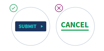
Affordance. Implement visual cues that indicate when an element links out to another page, shows whether a button is active or inactive, or provides contextual information.
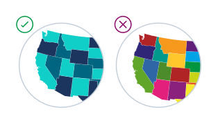
Color accessibility or contrast. Some people have a limited range of color vision, so it’s important to incorporate shapes and contrast to ensure that everyone can access the information they need.
Information hierarchy. Show data in the order of importance, so users won’t miss what matters most. “F-scanning” is a common way people consume information—essentially, they scan horizontally across the age, and then down. Understanding more about this and other common scanning patterns can help you put what’s most relevant first.
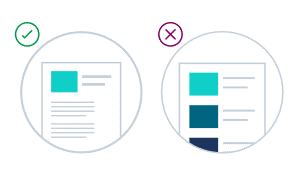
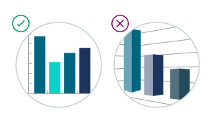
Simplicity. A cluttered dashboard might show a lot of information—but it’s useless if those looking at it can’t understand what they’re looking at. Less is more, so avoid confusing 3-D graphics or cramming too much on a page.
4 types of top-performing dashboards
Every dashboard is unique—but many fall into one of four categories, based on their intended purpose and audience. Each one has a different focus that allows you to tell a story more effectively and highlight the Key Performance Indicators (KPIs) that matter to your business.
1. Executive
2. Operational
3. Tactical
4. Analitical
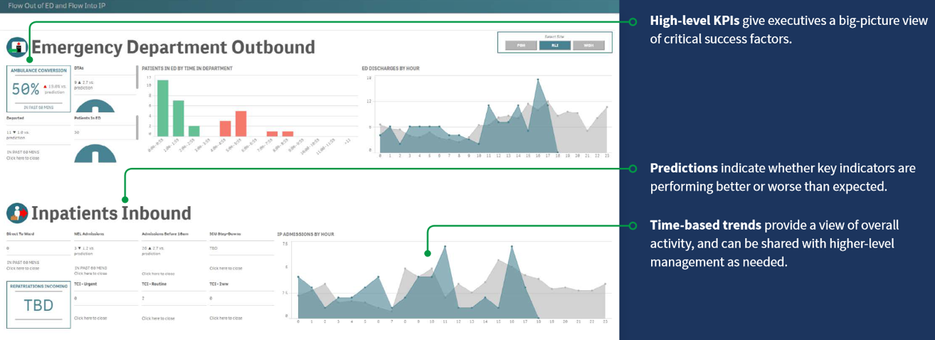
1. The Executive Dashboard
An executive dashboard is a reporting tool for monitoring long-term company strategy by examining critical success factors. These dashboards are usually complex in their creation and are mainly used by senior-level management. They’re also a keyway for companies to track KPIs against their goals over time.
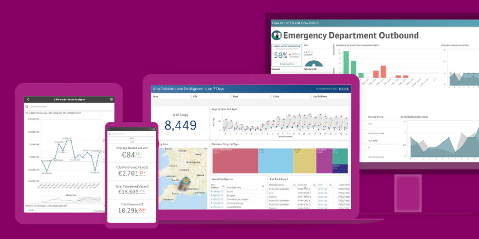
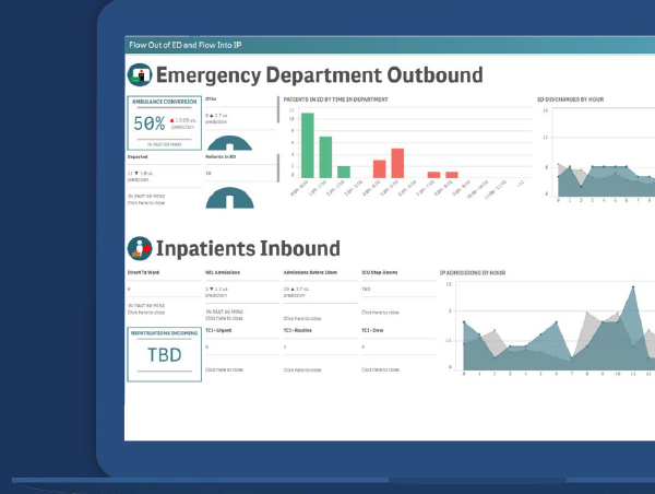
CASE STUDY – made for hospitals
Hospitals use data-driven insights to support desire for better systems. Dashboards give its teams a clear picture of important data, such as the flow of patients into and out of emergency rooms and drive better decision-making.
Executive dashboards allow them to:
Capture and maintain executive focus. Demonstrate progress on key goals and objectives, such as reducing hospital length of stay and improving clinical and operational experiences.
Adapt quickly to changing needs. A view of the most current data helps leaders anticipate pressures and develop the most effective approach to each day.
Învățărea și optimizarea pentru a atinge obiectivele strategice. Evidențiați KPI-urile care afectează managementul, experiența pacientului și dinamica personalului.
Executive Dashboard Example
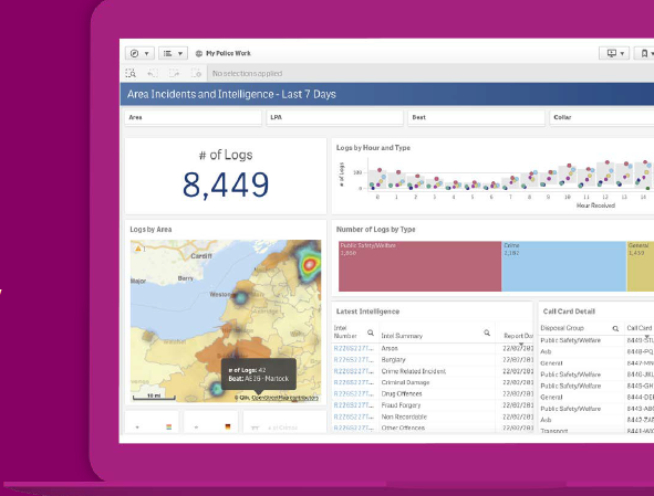
2. The Operational Dashboard
Operational dashboards are one of the most common types of dashboards. They’re used to monitor the current condition and pesent information in a simple, easyto-view format that everyone can understand. These dashboards aren’t designed for interactivity or to demonstrate progress toward a goal, but rather to provide a snapshot of the way things are now.
CASE STUDY – made for police department
Police department provides lifesaving services to their community. They use dashboards as a daily tool to help them monitor crime, track the location and volume of police reports, and more.
An operational dashboard makes the force more effective by allowing them to:
Stay informed on important items police teams need in their day-to-day work.
Gain efficiency with key feeds such as workload, compliance, top-demand locations, suspects, victims, data-quality issues, and crime statistics.
Monitor activity with features such as heatmaps that show concentrations of activity in a simple, intuitive way.
Operational Dashboard Example
3. The Tactical Dashboard
A tactical dashboard is used to track progress toward a goal, whether on a company-wide level or for a particular team or project. Interactivity is key for this type of dashboard, as you want to be able to determine why something is or isn’t going well. They help teams determine if what they’re doing is working—and if they need to make changes.
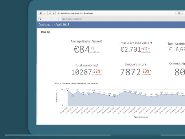
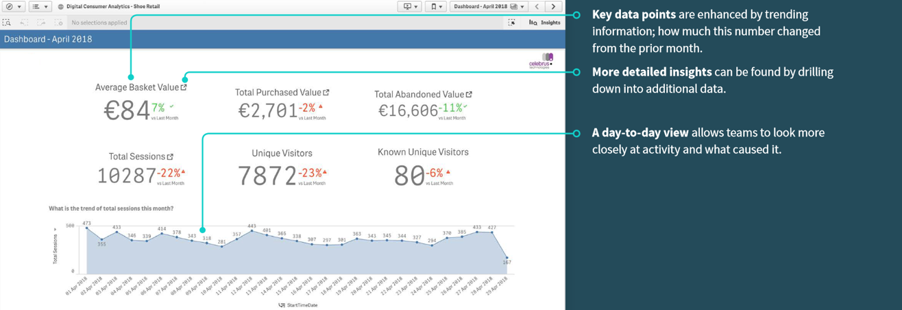
CASE STUDY – made for a sofware company
The software company is a vendor that specializes in customer intelligence. They wanted a simple, uncluttered dashboard that gave their business users the ability to make faster, better informed decisions with information on browsing and purchase behavior, interactions across digital channels, and more.
The software company designed their tactical dashboards to:
Guide the audience through key information, using a clean design style with important data at the top, adding colors and symbols to indicate increases and decreases, and providing tools that allow users to drill down into trends.
Offer interactive features, allowing users to find key insights such as when customers abandon shopping baskets during their journey, which location has the highest purchase spend, or what time of day people shop.
Enable valuable discoveries, such as identifying profitable customers that a business might want to target based on previous behavior and purchase pattern.
Tactical Dashboard Example
4. Analytical Dashboard Example
An analytical dashboard contains a vast amount of data created and used by analysts to provide support to executives. Analytics dashboards supply a comprehensive overview of business data and middle management is a crucial part of the user group.
These dashboards are used to drive decisions and play a key role in the business.
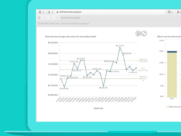
CASE STUDY – made for a Consumer Packaged Goods (CPG) Company
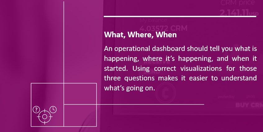
Consumer Packaged Goods (CPG) are items purchased by everyday consumers. In such a competitive market, it’s crucial to have an analytical dashboard that illuminates exactly what, where, and when people are spending. Without it, you can’t forecast market share growth and make important decisions about the future.
CPG companies should use analytic dashboards to:
Apply historical data to track trends, compare with multiple variables, and create predictions or targets.
Track growth by using the growth forecast chart to allow for micro/macro views and contrast CPG vs. market growth.
Create smart comparisons in the product category, using grids to track the market against goals.
Analytical Dashboard Example
Advice for visualizing KPIs
Key Performance Indicators can be complex, so it’s important to know how to work with them to produce the best results.
As you use KPIs in a dashboard, you’ll want to:
Identify your key metrics.
Collaborate with stakeholders in your team or project to identify the exact metrics that will help you align behaviors, drive strategy, and track success. For example, a sales team that is rewarded based on year-over-year growth cares about a different number than teams rewarded based on net sales. Not sure if you’ve chosen correctly? Test it out and look at the data.
Tell a story with your data.
What’s the big idea you want to convey? What are the key KPIs your business cares about? Use information hierarchy to guide the reader along. For instance, if the big story is this year’s customer growth, showcase it with large numbers, and use smaller numbers to indicate the prior year.
Continue to iterate and evolve.
When it comes to KPIs, you can’t “set it and forget it.” Defining the right metrics is an ever-evolving task. For instance, when a big competitor enters the market, or when customer behavior shifts, your KPIs may need to change too.
”Stories are remembered up to 22 times more than facts alone.”
Jennifer Aaker
General Atlantic Professor of Marketing, Stanford
Rolling out Your Dashboard: after compiling a checklist
Before you share it with your audience, do these things first:
Double-check that the metrics and questions support the story you want to tell
Remove anything that creates clutter and doesn’t support your story.
Confirm that your dashboard is consistent with your company design standards for items such as colors, fonts, and graphics.
Test your visualizations with a few trusted colleagues and incorporate their feedback.
If you want your audience to do something, add clear calls to action.
After you share your dashboard
Observe how your users are using it.
Identify what’s working and what’s not. Take notes so that you can make improvements, and your next dashboard can be even better.
There’s a story in your data, and Qlik™ helps you find it—fast.
Now it’s time to explore which dashboards work best for your business. Start by making dashboards of your own. Test, iterate, and keep on improving. You’ll quickly discover which dashboards work best for your team.
Qlik™‘s vision is a data-literate world, where everyone can use data and analytics to improve decision-making and solve their most challenging problems. Qlik™ Cloud based Active Intelligence Platform delivers end-to-end, real-time data integration and analytics cloud solutions to close the gaps between data, insights, and action. By transforming data into Active Intelligence, businesses can drive better decisions, improve revenue and profitability, and optimize customer relationships. Qlik™ does business in more than 100 countries and serves over 38,000 active customers around the world.
For information about Qlik™, please visit this site:qlik.com.
For specific and specialized solutions from QQinfo, please visit this page: QQsolutions.
In order to be in touch with the latest news in the field, unique solutions explained, but also with our personal perspectives regarding the world of management, data and analytics, we recommend the QQblog !
This website uses cookies to improve your experience. We'll assume you're ok with this, but you can opt-out if you wish.AcceptRejectRead More
Privacy & Cookies Policy
Privacy Overview
This website uses cookies to improve your experience while you navigate through the website. Out of these, the cookies that are categorized as necessary are stored on your browser as they are essential for the working of basic functionalities of the website. We also use third-party cookies that help us analyze and understand how you use this website. These cookies will be stored in your browser only with your consent. You also have the option to opt-out of these cookies. But opting out of some of these cookies may affect your browsing experience.
Necessary cookies are absolutely essential for the website to function properly. This category only includes cookies that ensures basic functionalities and security features of the website. These cookies do not store any personal information.
Any cookies that may not be particularly necessary for the website to function and is used specifically to collect user personal data via analytics, ads, other embedded contents are termed as non-necessary cookies. It is mandatory to procure user consent prior to running these cookies on your website.